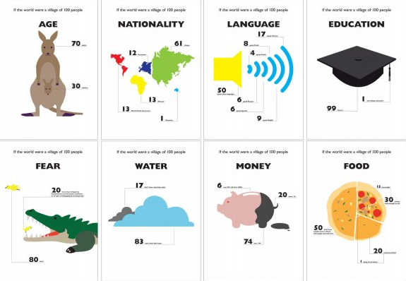
Designers seem to have taken a liking to the idea of showing world statistics as a village of 100. For example, if the world were a village of 100 people, 48 of them would be men. While we’re essentially just looking at percentages, the village metaphor seems to do a better job at humanizing the numbers. Along the same lines, this poster series from Tony Ng, World of 100, uses simple graphics to relate to demographics like money, food, and computers:
This is a self-initiated project based on the scenario – If the world were a village of 100 people. There are a few different versions of this text in circulation about the world’s statistics. I found the data very striking and neatly summarises the world that we live in. So I used information graphics to re-tell the story in another creative way.
A few of the graphics seem kind of random, but hey, it’s amusing.
[via The Daily Dish]


Edward Tufte would call these “ducks”. “A reference to the fad of building eye-catching structures that served as visual puns, such as hamburger-shaped burger joints and duck-shaped buildings. Ducks often featured trendlines that are spruced up with flashy colors and three-dimensions, making the data look more like rollercoasters than a serious attempt to convey information.” (From http://www.csiss.org/classics/content/44 )
Since you didn’t seem too happy about my pointing out that these are ducks….. http://twitter.com/flowingdata/status/1517127370
Do you agree that there is two different types of statistical representations? I definitely think these are beautiful designs, but I would never mistake them for serious statistics for proof or technical reports.
I see what you mean by “random;” the sexual orientation graphic made me laugh out loud.
@Eliot – sorry, that tweet came across wrong. I just wanna give others in the field some more face time. Tufte is so revered, but I think others have good stuff to say too.
…and yeah, there are definitely two – at the least – types of stat representations. These, I think, are meant to be comics more than stat graphics.
Pingback: Demographics in World of 100
Is there a version of these where the captions to the numbers are actually legible? I couldn’t find it on Tony’s site. Or do we not need that because these are just “comics”?
@Amos – that would’ve been helpful. i couldn’t find any high-res versions on the site either
Pingback: Explainist » Blog Archive » It Takes a Village of 100
Pingback: Graphic Stats: How to (Mis)Tell a Story « Technology, Health & Development