
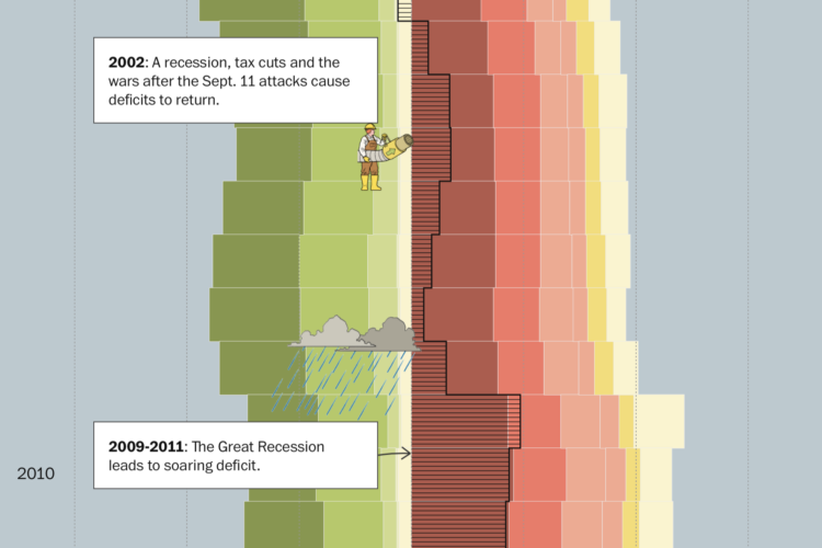
When you spend more than you make, you get debt. For the Washington Post, Youyou Zhou, with illustrations by Kyle Ellingson, visualized the difference over time for the United States.
A long stacked bar chart provides a backdrop of revenue and spending, and the animations give a little something to highlight significant spikes.
The debt has been running up for decades. It’s as if the government doesn’t even care.
 Visualize This: The FlowingData Guide to Design, Visualization, and Statistics (2nd Edition)
