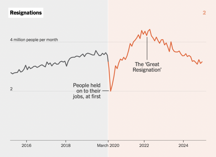
In almost every dataset about life and people that stretches back past March 2020, you can find the blip when Covid changed how we live. Aatish Bhatia and Irineo Cabreros, for NYT’s the Upshot, used a stack of 30 charts to show the shifts.
Each chart shows a pre-Covid gray on the left and a post-Covid red-orange on the right. The lines (or bars) on the post-Covid side extend the past when you scroll. Usually charts that show an empty space to start and then animate the rest are gimmicks, but the extensions highlight the sudden changes in this series.
The scroll style and dimensions are very mobile-first, as the stack plays out in a more familiar way on a phone. The style also makes the 30 charts feel like not too much.
 Visualize This: The FlowingData Guide to Design, Visualization, and Statistics (2nd Edition)