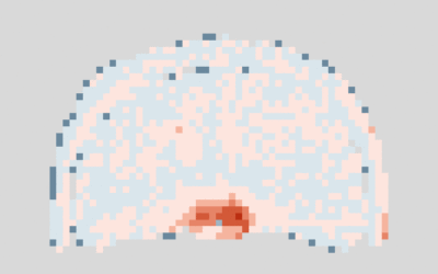
Heatmaps and Defining Color Scales
With color as the visual encoding, choose the scales that allow you to see actual patterns.
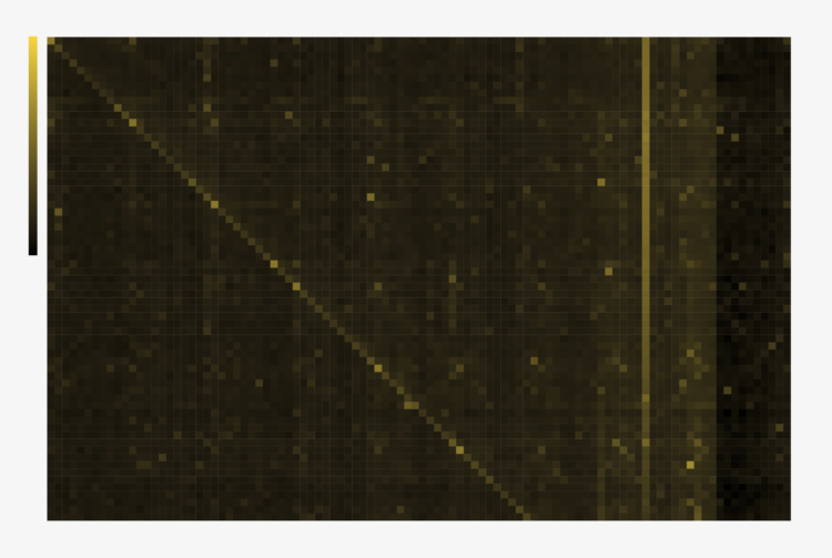
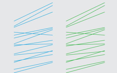
Heatmaps can be a quick and easy way to see a grid of numbers. Sometimes patterns pop out but only if you use a color scheme that complements the data. As you’ll see in this tutorial, it’s quite easy to end up with useless heatmaps. Luckily, it also goes the other direction.
To access this full tutorial, you must be a member. (If you are already a member, log in here.)
Get instant access to this tutorial and hundreds more, plus courses, guides, and additional resources.
Membership
You will get unlimited access to step-by-step visualization courses and tutorials for insight and presentation — all while supporting an independent site. Files and data are included so that you can more easily apply what you learn in your own work.
Learn to make great charts that are beautiful and useful.
Members also receive a weekly newsletter, The Process. Keep up-to-date on visualization tools, the rules, and the guidelines and how they all work together in practice.
See samples of everything you gain access to:
About the Author
Nathan Yau is a statistician who works primarily with visualization. He earned his PhD in statistics from UCLA, is the author of two best-selling books — Data Points and Visualize This — and runs FlowingData. Introvert. Likes food. Likes beer.