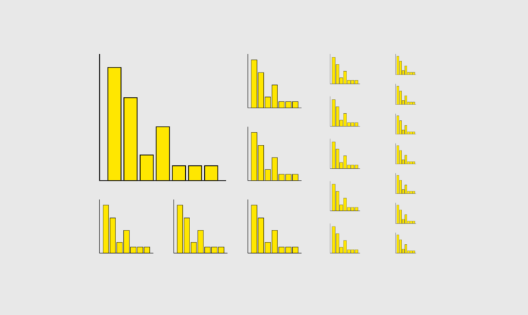
One of the fun parts of pushing out charts in public is that a lot of people can potentially see your work. Something that you spent time and effort on might end up in various places. Sometimes in unexpected places. Do you just shrug and let it pass or do you try to get a handle on the work so that it’s not misconstrued out of context?
Welcome to issue #302 of The Process, the newsletter where we look closer at how the charts get made. I’m Nathan Yau, and I’ve been basking in administrative duties this week. I think I really like data entry?
To access this issue of The Process, you must be a member. (If you are already a member, log in here.)
The Process is a weekly newsletter on how visualization tools, rules, and guidelines work in practice. I publish every Thursday. Get it in your inbox or read it on FlowingData.
You also gain unlimited access to hundreds of hours worth of step-by-step visualization courses and tutorials, which will help you make sense of data for insight and presentation. Resources include source code and datasets so that you can more easily apply what you learn in your own work.
Your support keeps the rest of FlowingData open and assures the data keeps flowing freely.


