In this chart from The Economist that shows ice extent from 1972 up to present, that falling line for 2023 looks not good.
Losing ice in the Antarctic
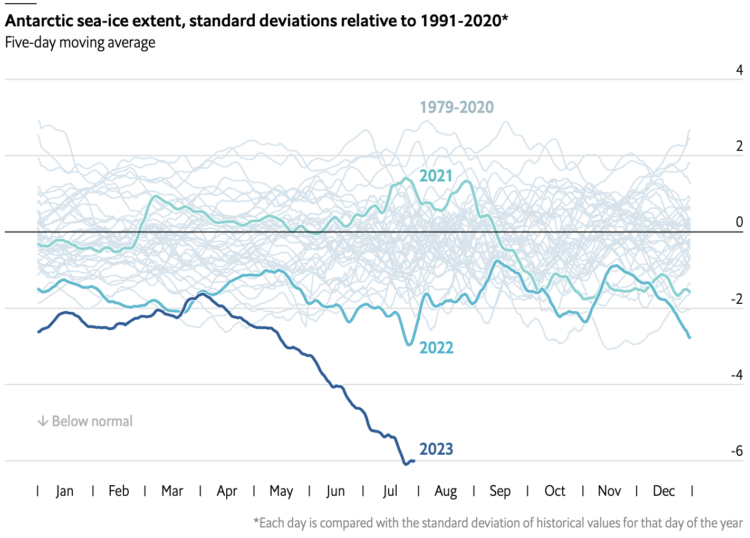
Chart Type Used

Second Edition
 Visualize This: The FlowingData Guide to Design, Visualization, and Statistics (2nd Edition)
 Visualize This: The FlowingData Guide to Design, Visualization, and Statistics (2nd Edition)
New tools, refined process.