Mixed Feelings of Happiness and Meaning

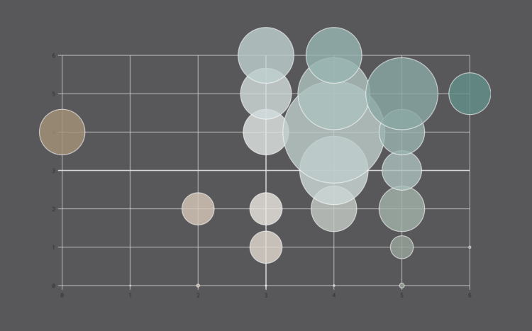
When people are asked to score happiness and meaning throughout the day, like they were in the American Time Use Survey, scores tend to be higher, which is what you see in the averages. Generally speaking, people will say they are happy and what they do is meaningful.

However, while the averages give you a rough idea of how activities score, the distribution for an activity is often more mixed than just happy and meaningful. These charts show the distribution for 150 of the most common activities over the full range of scores.

Become a member. Support an independent site. Get extra visualization goodness.

See What You Get

Favorites

Years You Have Left to Live, Probably

The individual data points of life are much less predictable than the average. Here’s a simulation that shows you how much time is left on the clock.

A Day in the Life of Americans

I wanted to see how daily patterns emerge at the individual level and how a person’s entire day plays out. So I simulated 1,000 of them.

Guessing Names Based on What They Start With

I’m terrible at names, but maybe data can help. Put in your sex, the decade when you were born, and start putting in your name. I’ll try to guess before you’re done.

The Stages of Relationships, Distributed

Everyone’s relationship timeline is a little different. This animation plays out real-life paths to marriage.