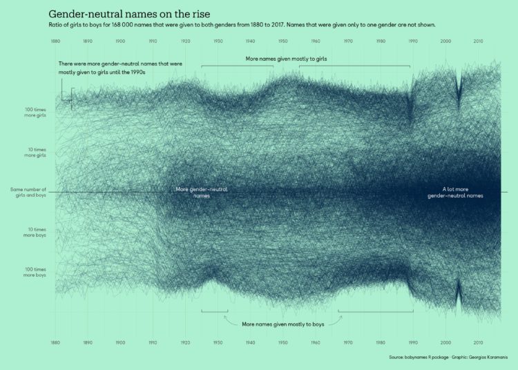
Georgios Karamanis plotted the ratio of girls-to-boys over time for all the names in the Social Security Administration dataset. You can see the more gender-specific names at the edges and more gender-neutral names clustering in the middle.
Those dips in 1989 and 2004 are curious. Otherwise, the increase in gender-neutral names seems to match up with my analysis from a while back.


