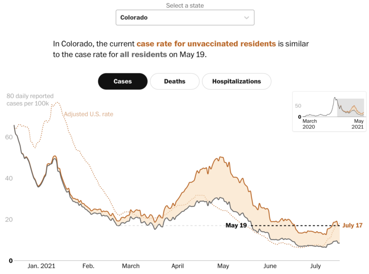
Covid-19 cases in the United States were down, but they’re moving up again, mostly among the unvaccinated. Dan Keating and Leslie Shapiro for The Washington Post break down the comparisons by state.
A difference chart for each state shows the overall rate compared against an adjusted rate for the unvaccinated population. As you might expect, the rate for the latter is always higher.
There are three more points of reference. A dotted line shows the adjusted national rate, a black dashed line shows how the current rate is a step back to a previous time, and a smaller, zoomed out version of the chart in the top right provides context back to March 2020. You can see it for cases, deaths, and hospitalizations.
Getting vaccinated strongly appears to be the way to go any way you cut it.


