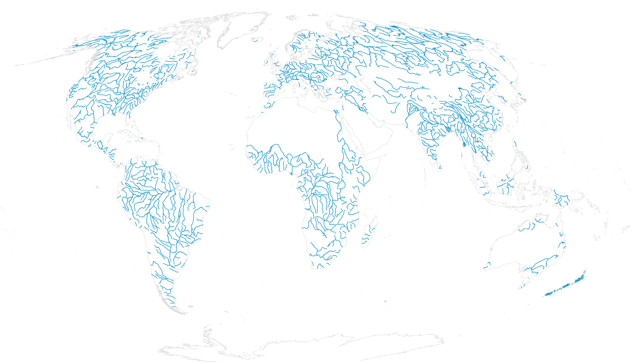
I’m happy to announce a new course on mapping geographic data in R, using the ggplot2 package. The course is by data journalist and visualization consultant Maarten Lambrechts, and it’s available immediately to FlowingData members.
If you’re not a member yet, now is a great time to join. You get instant access to this course, plus four others and over a hundred in-depth visualization tutorials.
For those who’ve read FlowingData for a while probably know that I’m not much of ggplot2 user. It’s not that I don’t like it. I just never worked it into my workflow, and what I’m using now hasn’t stalled my work yet.
But when it comes to visualizing data, I’m a firm believer in learning a wide array of tools. A flexible toolset lets you visualize data in the way that you want. The tool shouldn’t be the limiting factor.
Hence, this course.
I worked through the course myself, and I’ll tell you first-hand that it’s fun, practical, and will get you up to speed quick. There’s real data, concrete examples, and you’ll be making beautiful maps with your own data in no time.


