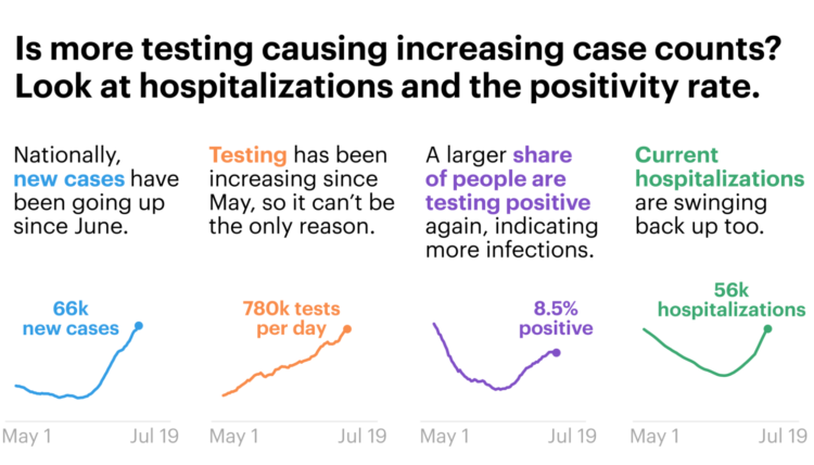
For ProPublica, Caroline Chen, with graphics by Ash Ngu, provides a guide on how to understand Covid-19 statistics. The guide offers advice on interpreting daily changes, spotting patterns over longer time frames, and finding trusted sources.
Most importantly:
Even if the data is imperfect, when you zoom out enough, you can see the following trends pretty clearly. Since the middle of June, daily cases and hospitalizations have been rising in tandem. Since the beginning of July, daily deaths have also stopped falling (remember, they lag cases) and reversed course.
I fear that our eyes have glazed over with so many numbers being thrown around, that we’ve forgotten this: Every day, hundreds of Americans are dying from COVID-19. Some days, the number of recorded deaths has reached more than 1,000. Yes, the number recorded every day is not absolutely precise — that’s impossible — but the order of magnitude can’t be lost on us. It’s hundreds a day.
Cherrypicking statistics is at an all-time high. Don’t fall for it.


