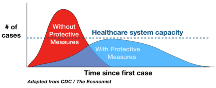
I know it seems like ages ago when we were talking about flattening the curve, but it was a rallying cry at some point. The charts that started it all weren’t particularly fancy or something to admire. For Mother Jones, Abigail Weinberg wondered why it still worked:
There were axes and legends, and Drew Harris, a professor of population health, would later add a line representing the capacity of the health care system, but in truth there was nothing particularly rigorous about the chart. It was a work of the imagination, too artless to be art but lacking the hard empiricism we expect of science. That in-betweenness is what made it so effective.
At the time, there were so many unknowns that projections seemed hard to grasp onto. But the visual concreteness of a chart, even though it was abstract and not based on actual data, seemed to be just enough certainty.


