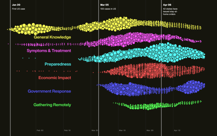
As you would imagine, what we search for online shifted over the past few months. The unknowns push information gathering. Schema Design, in collaboration with the Google News Initiative and Axios, broke down the main changes in search since January.
Using a beeswarm chart, each circle represents a query and the size of a circle represents the rank in a query. I really wanted to mouse over the circles to see specifics, but maybe that would’ve been too much information in one view.


