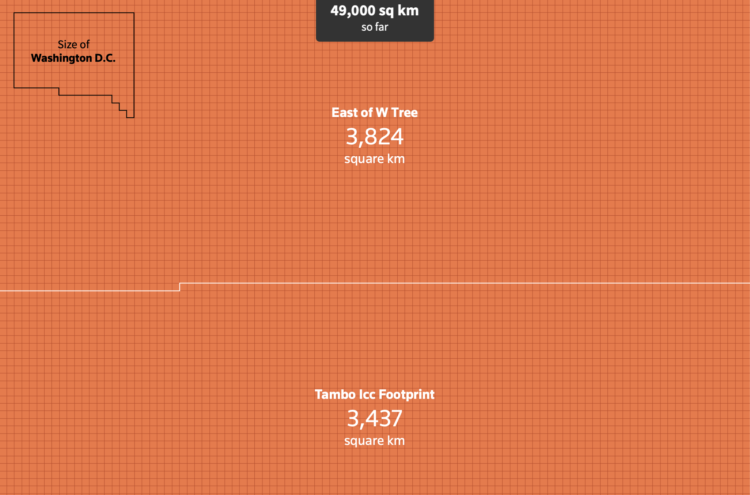
Outside of Australia, it can be a challenge to get a grasp of how bad the bushfires actually are. There have been some attempts that overlay a map of Australia over various locations, but they’ve varied in accuracy. This scrolling unit chart by Reuters Graphics makes the comparison more concrete.
Each square represents a square kilometer, a counter at the top ticks up as you scroll, and geographic points of reference appear as you go down. Effective.

 Visualize This: The FlowingData Guide to Design, Visualization, and Statistics (2nd Edition)