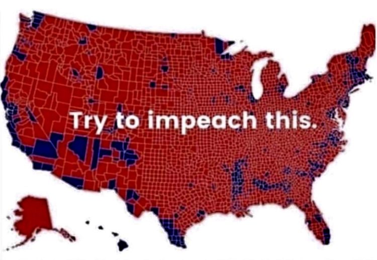
Philip Bump explains why the “impeach this” map is a bit dubious:
By now, this criticism of electoral maps is taught in elementary schools. Or, at least, it should be. Those red counties in Montana, North Dakota, South Dakota and Wyoming, for example, are home to 1.6 million 2016 voters — fewer than half of the number of voters in Los Angeles County. Trump won 1 million votes in those states, beating Hillary Clinton by a 580,000-vote margin. In Los Angeles, Clinton beat Trump by 1.7 million votes.
As Alberto Cairo already went into, it’s not so much that the map itself is incorrect. It’s a bivariate map. It shows which counties voted more for one person versus another. It’s more about the context of how the map is used. It’s the visualization equivalent of pulling a quote out of context and people seeing what they want to see.


