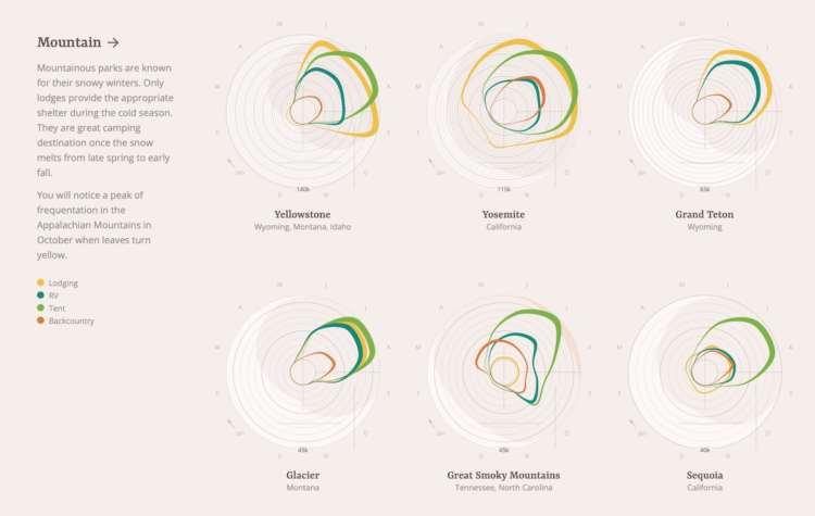
When staying at national parks, some people choose a tent. Some bring an RV. Others might stay in a lodge or sleep under the stars. Of course, it depends on where they stay and the weather during any given time of year. Using data from the National Park Service, Jordan Vincent charted all these things with a multi-faceted approach.
Each band represents patterns for an accommodation type over a year, band width represents number of nights stayed per month, and radius represents volume. Average temperature sits in the background.
Oftentimes, putting so many variables together in one view hides patterns, but this abstract view feels intuitive, even if less concrete. [Thanks, Dario]


