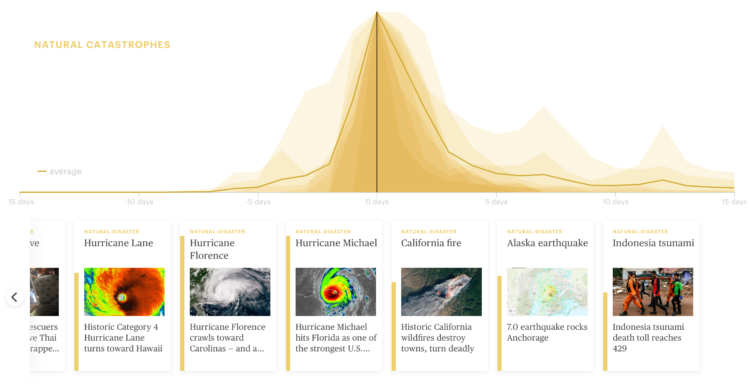
A wideout view of the news cycle can look like a series of rise and falls. Something captures the general public’s attention, and then it fades off. Thank you, next. This collaboration between Schema Design and Google Trends charts search volume for news stories and aligns them by their peaks, so that you can see these rise and falls.
Transparent areas overlaid on each other show an “average” trend, and the more irregular shapes are made obvious because they stand out from the rest.
See also the simpler view by Axios, who contributed stories to the project.


