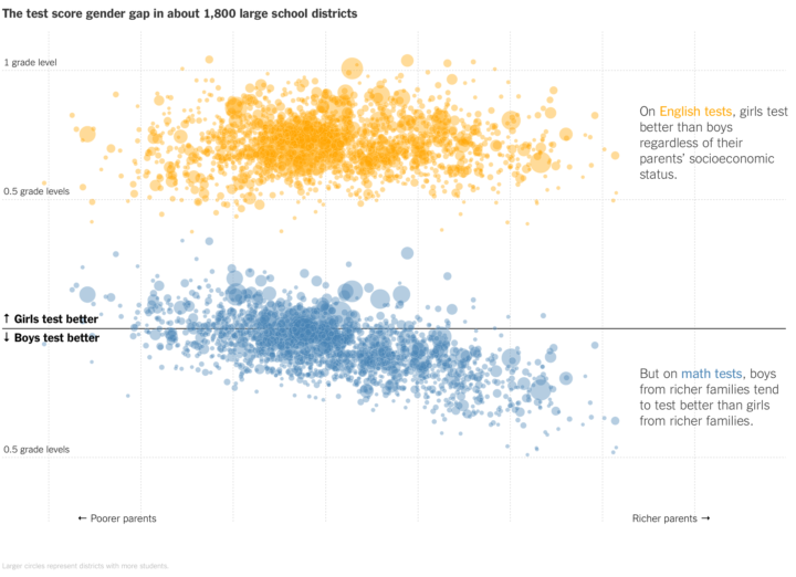
This is quite the scatterplot from Claire Cain Miller and Kevin Quealy for The Upshot. The vertical axis represents by how much girls or boys are better in standardized tests; the horizontal axis represents wealth; each bubble represents a school district; and yellow represents English test scores, and blue represents math test scores.
The result: a non-trend up top and a widening gap at the bottom.


