How I Made That: Animated Square Pie Chart
Also known as waffle charts. Using animated transitions between values, you can allow for comparisons between categories.
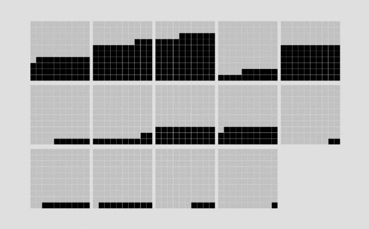
I’m a fan of element-based visualization methods, because they tend to shorten the path from abstract data back to reality. So when I wanted to compare percentages across various demographics, I went with the square pie chart instead of stacked bars or standard pie charts.
I’ve made these in R, but this was the first time I made them using d3.js. I wanted animated transitions when you switched between different groups of people. Here’s how I made it.
To access this full tutorial, you must be a member. (If you are already a member, log in here.)
Get instant access to this tutorial and hundreds more, plus courses, guides, and additional resources.
Membership
You will get unlimited access to step-by-step visualization courses and tutorials for insight and presentation — all while supporting an independent site. Files and data are included so that you can more easily apply what you learn in your own work.
Learn to make great charts that are beautiful and useful.
Members also receive a weekly newsletter, The Process. Keep up-to-date on visualization tools, the rules, and the guidelines and how they all work together in practice.
See samples of everything you gain access to:

