Christmas Movies as Charts
It’s been quite the year of randomness and things we never would have imagined at any other time before they occurred. So in the spirit of this year, here’s A Christmas Story for you.
I put it in the form of charts, because that’s the only way I know how to communicate. (It’s a problem, I know. I’m working on it. I mean come on, cut me some slack. It’s almost Christmas.)
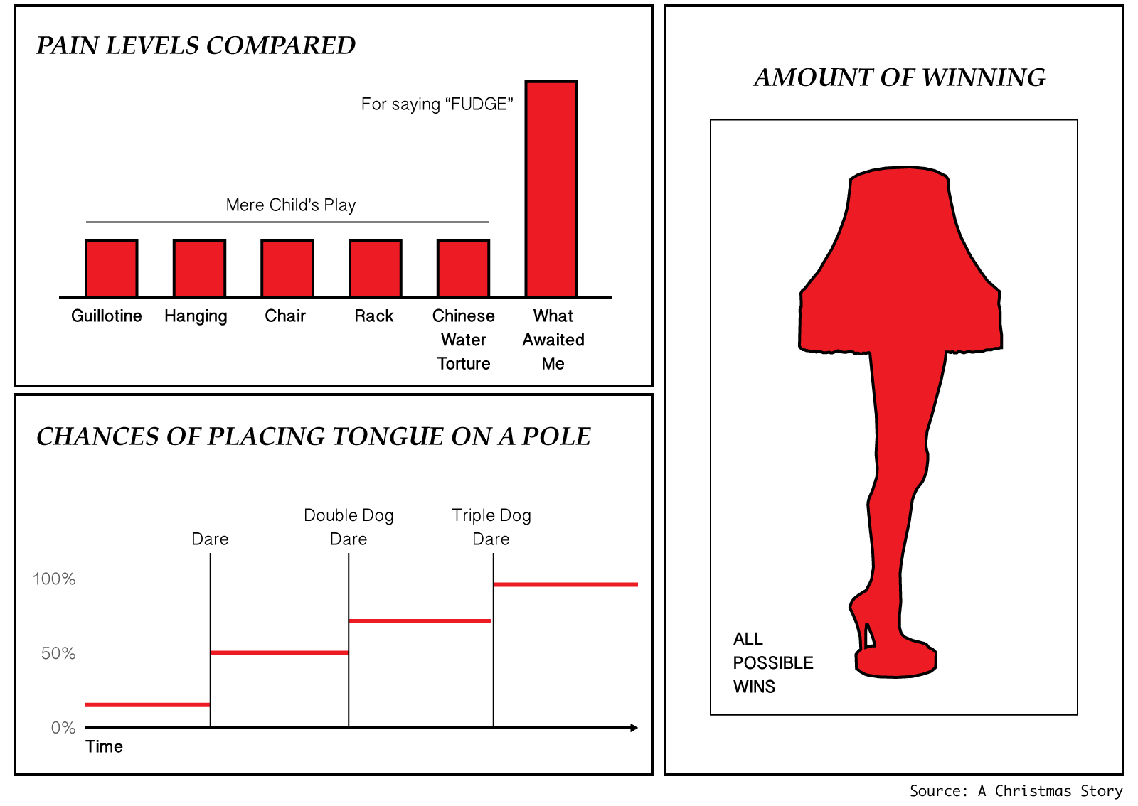
In any case, as I was saying. Here are some Christmas charts for you. They may or may not be based on movies.
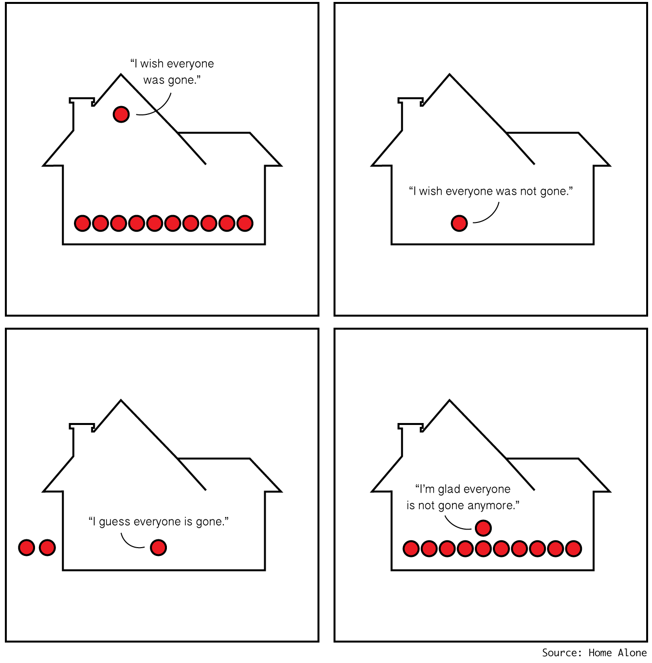
I think we can all agree ’tis the season to be with family and friends rather than Home Alone.
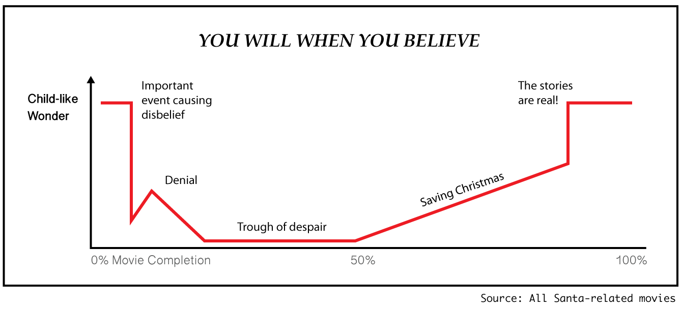
Or maybe you’re not quite there yet. I say just give it time. Maybe take a ride on the Polar Express towards the Miracle on 34th Street. You might see a Grinch or an Elf. Who knows? Keep an eye out for any lengthy Clauses though.
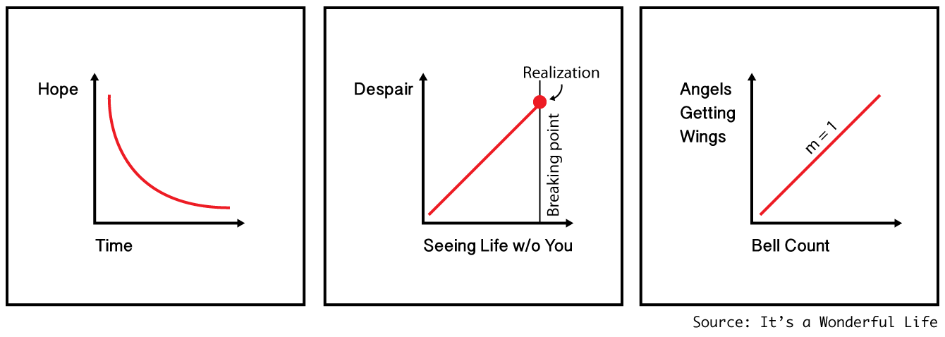
I think all in all, It’s a Wonderful Life.
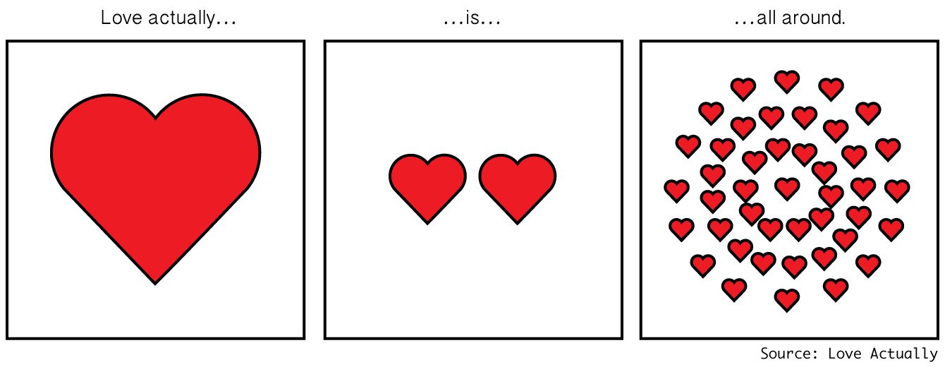
And if you look, you’ll see that Love Actually is all around.
Merry Christmas.
Become a member. Support an independent site. Get extra visualization goodness.
See What You Get