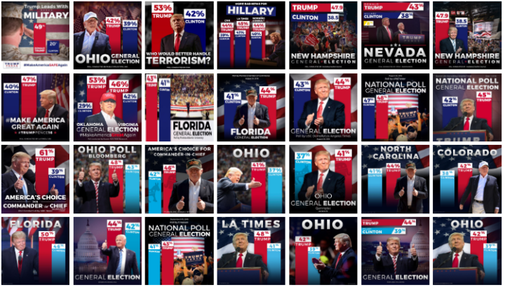
The Donald Trump campaign has a habit of highlighting poll results with a bar chart that just shows the top portion. The bottom baseline fades away somewhere or the values follow a random scale. They’re supposed to start at zero.
John Muyskens for the Washington Post highlights the campaign’s bar chart usage, and why it’s problematic. Sometimes if the bars were placed correctly, the results would show more favorable for Trump. The bar charts are just decorative, basically.


