How to Make Square Pie Charts in R
Instead of traditional pie charts that rely on angles and arc lengths to show parts of a whole, try this easier-to-read version.
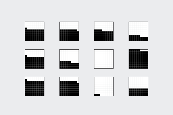
Regular pie charts have their issues with the perception of angle and arc length, but their main advantage is that they represent parts of a whole. The metaphor is universally known. The square pie chart offers an alternative without sacrificing the metaphor, and some studies suggest that they’re easier to read and more accurate at showing data.
In this tutorial, you learn how to make these things in R. The final result is a squarePie() function that you can use to quickly use the chart type.
To access this full tutorial, you must be a member. (If you are already a member, log in here.)
Get instant access to this tutorial and hundreds more, plus courses, guides, and additional resources.
Membership
You will get unlimited access to step-by-step visualization courses and tutorials for insight and presentation — all while supporting an independent site. Files and data are included so that you can more easily apply what you learn in your own work.
Learn to make great charts that are beautiful and useful.
Members also receive a weekly newsletter, The Process. Keep up-to-date on visualization tools, the rules, and the guidelines and how they all work together in practice.
See samples of everything you gain access to:

