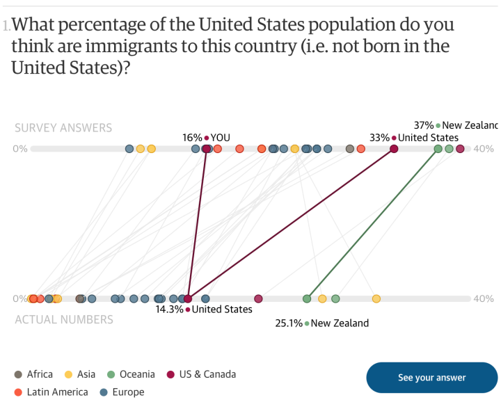
In their annual survey that tests public perception against reality, Ipsos Mori asked people about their own country’s numbers. What’s the obesity rate in your country? What percentage of people in your country are immigrants? The Guardian setup the quiz so that you can see how your own perceptions compare against both reality and others’ in your country.
After each question, you get the actual (estimated) value, and you can compare all countries in a second view. Some countries overall are better than others, which you see at the quiz end. Fun.
I’m curious what the distributions look like and what the margin of error is. Are the countries that rank low uninformed, such that survey answers are all over the place, or is the perception universally off, such that answers tightly cluster around the average?
Essentially: uninformed versus misinformed.


