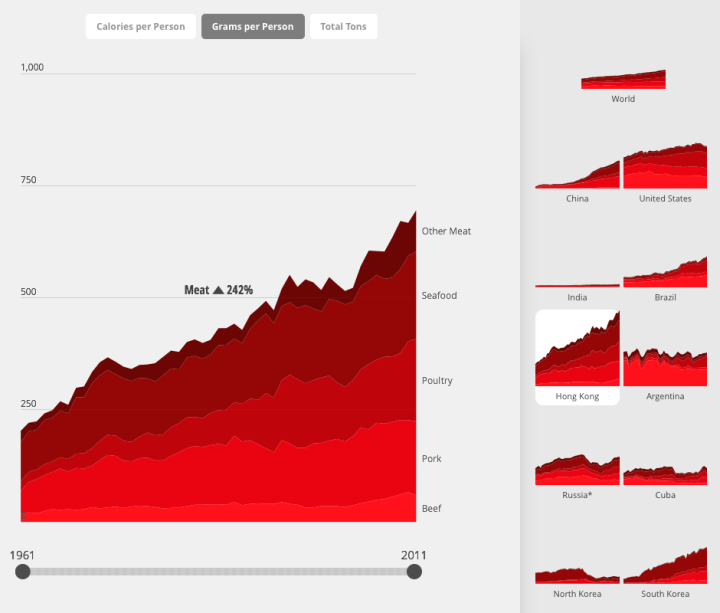
Diets vary around the world. Fathom Information Design for National Geographic charted the differences between countries using data from FAOSTAT. Small multiples on the right panel provide a wideout view of countries over time, and when you click on one, you get a more detailed view. Toggle between categories and filter by years.
I always thought the United States had the highest meat consumption and that it was by a lot. Based on these estimates, not so much.


