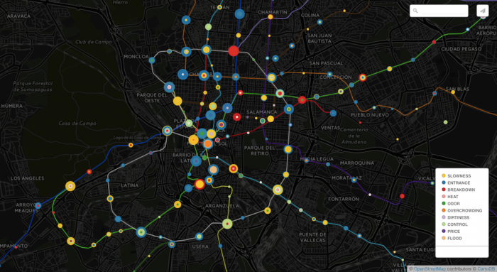
This map of subway complaints in Madrid isn’t geographically relevant to me, but the encoding scheme is interesting.
Each spot represents a station, and a collection of concentric circles represent the various types of complaints for that station. Larger circles represent more complaints, and more circles represent more complaint types.
So for someone in charged of repairs, maintenance, and overall system performance could pretty quickly figure out the problem areas and what actions to take.


