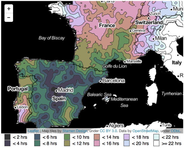
After seeing an isochrone map drawn by Francis Galton, Peter Kerpedjiev was curious if he could apply the method to travel times in Europe.
It conjured images of steam trains (were the trains in 1900 still running on steam?) chugging along between the imperial centers of Vienna and Budapest. It made me wonder about how people commuted from the train station to their final destination. It made me question my conception of how long it took to get from place to place. Most of all, however, it made me wonder what such a map would look like today.
Using data from the Swiss public transport API, Kerpedjiev built similar maps with major cities as starting points. Simply select a city, and the map shows how long it would take to get to areas in Europe.
I fully expect someone to do something similar for the US within a month. [via Guardian]


