Chart of Cousins

I have a big family, and it seems at every get-together there are new additions and more kids running around. At some point, I lost track of how I was related to everyone else. I mean, I know that some people are my cousins and I can trace everyone back to a common ancestor, but I’m not sure what to call everyone.
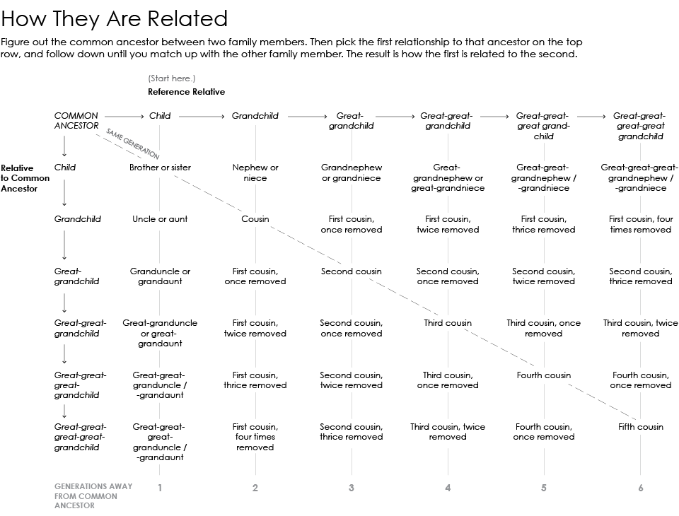
So after the latest get-together, I figured I’d chart it out. It turns out there are a lot of charts and explainers available (not surprising), but they were kind of hard to read. Hopefully the revised chart above makes it a bit easier.
Here’s how it works. Figure out the common ancestor between two relatives. Then select the relationship of the first relative to the common ancestor in the top row. Move down to the row that corresponds to the relationship of the second person to the common ancestor. The result is the relationship of the second person to the first.
For example, say the first person is the grandchild of the common ancestor, and the second person is a great-grandchild. Therefore, the second person is the first cousin once removed from the first.
There is of course a pattern to all of this. Wikipedia explains:
There is a mathematical way to identify the degree of cousinship shared by two individuals. In the description of each individual’s relationship to the most recent common ancestor, each “great” or “grand” has a numerical value of 1. The following examples demonstrate how this is applied.
Example: If person one’s great-great-great-grandfather is person two’s grandfather, then person one’s “number” is 4 (great + great + great + grand = 4) and person two’s “number” is 1 (grand = 1). The smaller of the two numbers is the degree of cousinship. The two people in this example are first cousins. The difference between the two people’s “numbers” is the degree of removal. In this case, the two people are thrice (4 — 1 = 3) removed, making them first cousins three times removed.
Now I don’t have to think about it all now, and can just say “Hi, first cousin once removed.” What a load off of my shoulders.
Become a member. Support an independent site. Get extra visualization goodness.
See What You Get


