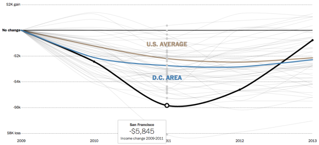
Since the recession, it’s taken a while for household incomes to come back to where they were in 2009. In most parts of the country, incomes are still lower, however, it appears they are making their way back to 2009 levels. With the Census Bureau’s recent release of data from their American Community Survey, the Washington Post charted the annual difference from 2009 to 2013.
Each line represents a metropolitan area’s difference in household income of a current year, compared to that of 2009. So the closer to or higher above the thin black baseline the better.


