We know that millions of Americans move to different counties every year, and when you look at the net totals, you see a pattern of people migrate from the midwest to the coasts. However, look at migration across demographic categories, and you see more detailed movement. This was the goal of researchers at the University of Wisconsin-Madison, and they recently released their estimates, in map form.
Every year, about 10 million Americans move from one county to another. Migration rates vary by age, race, and ethnicity and with local and national social and economic conditions over time. Still, individual counties’ patterns of age-specific migration tend to be consistent over time telling demographic stories about local places. This website highlights these stories by providing reliable estimates of net migration broken down by age, race, Hispanic-origin, and sex for all U.S. counties each decade from 1950 to 2010.
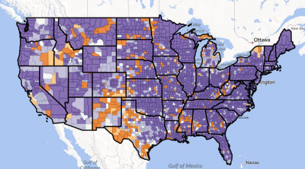
For example, the map above simply shows net migration totals during the 2000s. Deeper orange represents more people who moved away than moved to a county, and deeper purple shows the opposite.
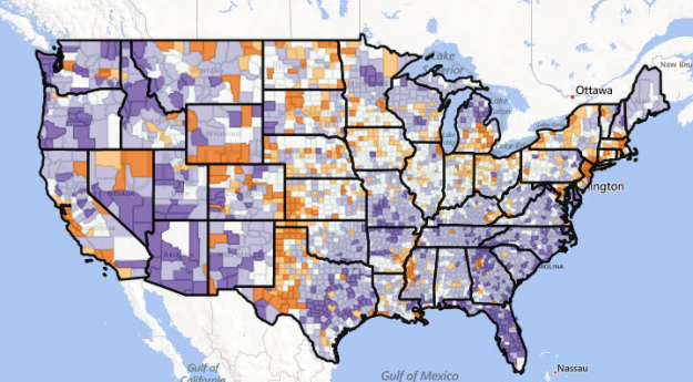
Now here’s the map for Hispanic migration during the same time period. As you’d expect, you see a large shift north.

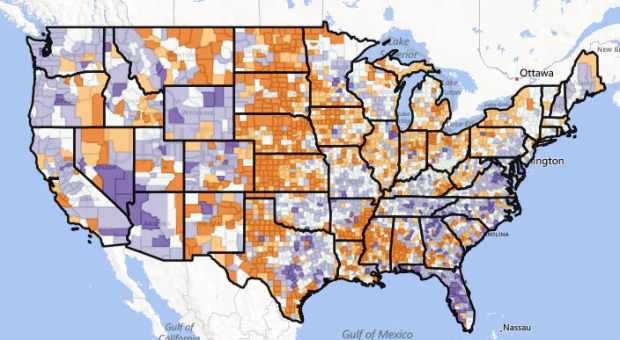
This is what migration looks like for people aged 55 to 74. It’s similar to the first net totals map, but there’s a stronger net positive in the southeast for this age bracket.

The highlight of this project is the data though.
The estimates for the 2000s are readily available in several formats, and it includes more breakdowns than the browser does, namely age categories combined with race. Estimates for previous decades can be downloaded from ICPSR. Finally, you can also download data from the browser. Select a map view via the dropdown menus, and then click on the link to “Download map data” in the top right of the sidebar.


