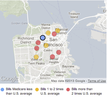
 The Centers for Medicare and Medicaid Services released billing data for more than 3,000 U.S. hospitals, showing high variance in cost of health scare across the country and even between nearby hospitals.
As part of the Obama administration’s work to make our health care system more affordable and accountable, data are being released that show significant variation across the country and within communities in what hospitals charge for common inpatient services.
The data provided here include hospital-specific charges for the more than 3,000 U.S. hospitals that receive Medicare Inpatient Prospective Payment System (IPPS) payments for the top 100 most frequently billed discharges, paid under Medicare based on a rate per discharge using the Medicare Severity Diagnosis Related Group (MS-DRG) for Fiscal Year (FY) 2011. These DRGs represent almost 7 million discharges or 60 percent of total Medicare IPPS discharges.
The data is downloadable as CSV or Excel files and is surprisingly usable and worth a look.
The New York Times has a useful per-hospital browser and The Washington Post provides quick comparisons by state.

