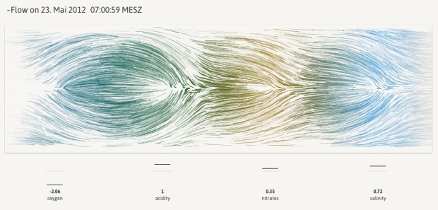
In Newcastle, there’s a floating tide mill building on the River Tyne. The mill turns to generate power for the building, and in that flow of water are four sensors for oxygen, acidity, nitrates and salinity. Values for these metrics, along with wheel speed, are captured about every thirty minutes. Stephan Thiel of Studio NAND, in collaboration with Moritz Stefaner, visualized this data in an abstracted simulation of the flow through the tidemill.
Particles are continuously moving from right to left, being attracted or repelled by four circular zones representing the sensor values. The overall behavior of the particles is influenced by the turning speed of the waterwheel. If the value of one sensor is above its mean value, particles are repelled. If the value is below the mean, particles are attracted towards the center of the zone.
For example, if all four values are greater than the mean, you end up with four circular swells around these zones. In the above, oxygen is below the mean, so the simulated flows head towards the center of the oxygen zone instead of move around it like with the three zones before. So you end up with a sort of fingerprint for each window of data capture.
The data itself is probably of little interest to anyone who doesn’t work at the mill, but the aesthetics of the piece is calming and certainly evokes the context of what the data represents.
The wind map by Wattenberg and Viegas and Drawing Water by Wicks come to mind. Oh, and also perpetual ocean.


 Visualize This: The FlowingData Guide to Design, Visualization, and Statistics (2nd Edition)
