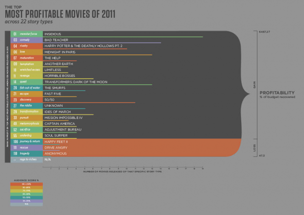
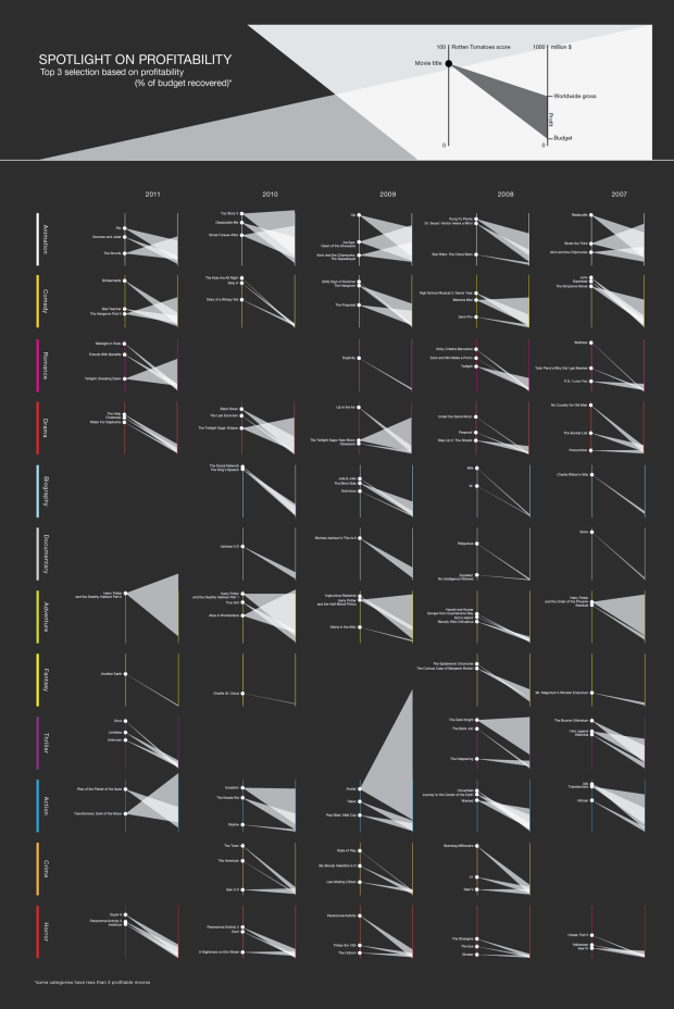
Movies are a curious business. There a variety of forces that encourage people to pay for a movie ticket with an ever-increasing cost, one of those being the aggregate ratings on Rotten Tomatoes, but it’s not uncommon for well-reviewed movies to profit small and poorly reviewed movies to profit big. Krisztina Szucs takes a look at this relationship between Rotten Tomatoes score and profit.
It’s like a parallel coordinates plot, but the second column represents two values, budget and worldwide gross, which creates a spotlight effect. So big spotlights represent high profit, whereas narrow spotlights that point down represent well reviewed movies that had relatively smaller profit. Movies are categorized by year and genre.
See the full-sized version here.
This was an entry for the Information is Beautiful Awards, and the challenge was to make use of this dataset of Rotten Tomatoes scores and worldwide gross, among other things. They announced the winners yesterday, but Szucs’ work didn’t place even though it was better than the graphic that did win.

The judging comments for the winner: “Beautiful colours. Simple condensed design. Clever use of multiple axis. Intriguing findings.” No offense to the winning graphic designer, but whaaaa? I didn’t get that at all. The rainbow palette must have blinded the judges into confusion.


It would be awsome if the profitabily chart would have a timetable. Then you could argue when is the time right for the movie to enter the public domain, thus putting an end to copyright monopoly. Please contact if you have any info on my comment.
McCandless and his ilk are confusing information beauty with design beauty…the fact that he gets a decent amount of press is, at least in my opinion, harmful to the infoviz/dataviz community.
Also, awesome “blinded” comment.
Nathan, I agree. The ‘spotlight’ graphic hits the sweet spot–good looking, engaging, and most importantly, useful.
Whoa, Szucs’ job is amazing – it does a great job of exploring unusual relationships in data.
Rainbow color maps are a big no no. McCandless should know better.
Nathan, I completely agree with you. The winning entry tries to jam in so much information with its “clever use” of axes that my brain is imploding trying to find anything relevant.
Maybe you didn’t have enough space to also post about the 2nd place winner, but I thought the runner-up was even worse; it took me a solid 5 minutes to realize that the red seats implied “profitable”, and green seats were just filler. Wha??
I’m not sure I can lift any insights from either Ms Szucs’s entry or any of the winners. The first napkin sketch is the only visualization that I can take anything away from. Although “Spotlight” is certainly a step above the winners æsthetically, giving so much weight to year of release was probably a misstep since significant change over such a short period is very unlikely.
Initially, I had some difficulty with the spotlight graphic. But, the more I stared at it, the more I saw so many interesting things. Variables of tomatoes score, category, year, gross, revenue and profit. It became very easy to examine the relationship by moving left or right or up and down looking at each distinct set. I think that separation and organization makes the usability extremely high. Top marks and should have been over the rainbow (awful pun intended).
Couldn’t agree more, Nathan. I also thought that Barinov Tëma’s entry (http://infobawards.s3.amazonaws.com/HOLLYWOOD-BUDGETS-T-ma-Barinov.png) was especially strong, particularly the use of treemap small multiples to illustrate the genre composition of each major movie studio’s offerings. Really professional, illuminating, and far denser than the selected winner.
The y-axis on the winning entry is quite misleading. I find the ‘Spotlight’ visualisation far more enlightening.
On a slightly random, but related note, that’s not how movie companies calculate profitability:
http://www.theatlantic.com/business/archive/2011/09/how-hollywood-accounting-can-make-a-450-million-movie-unprofitable/245134/
I too was disappointed with some of the Information is Beautiful entries too. Form triumphs over function, usability, or even the notion of telling a story with the data in many of them, despite lip service being paid to these concepts by the judges.
The kind of thing which draws their attention seems to be cute flash animations with nicely-chosen colours and lines, but where ability to read off any useful properties of the data is at best a secondary design goal.
Also, don’t get me started on the breathless cheerleading of ‘data science’ which has been done without the first awareness of proper statistical methodology.
The only problem I have with the spotlight is (unless I’m missing something) how do I tell if the profit was actually a loss?
@Matt — no losses in this graphic since only the top 3 movies based on percent of profitability are shown for each year.