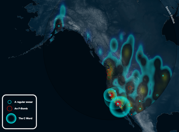
A fun map by Jamie Popkin of Little Earth that animates the use of the F-bomb, C-word, and “regular swear word” over a month. There isn’t much information about where the data comes from, but I’m guessing Twitter. Each circle represents the use of a swear word, and the intensity grows as time passes. Too bad it doesn’t cover the world or the entire United States.
[PottyMouth via @awoodruff]


