The Rural West Initiative and the Bill Lane Center for the American West explore the growth of newspapers across the United States:
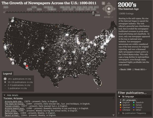
With American newspapers under stress from changing economics, technology and consumer behavior, it’s easy to forget how ubiquitous and important they are in society. For this data visualization, we have taken the directory of US newspaper titles compiled by the Library of Congress’ Chronicling America project — nearly 140,000 publications in all — and plotted them over time and space.
To see the distribution of papers over the years, simply click and drag the slider on the top. Context for each decade is displayed on the right. Each circle represents papers in a city, and the larger the circle the more papers.
Catch the animated version below. They start in the east and make their way west.
Pretty cool. One caveat however is that the data does have some known issues in terms of comprehensiveness. It doesn’t include all papers from 1690 to present, and there isn’t a way to easily update the dataset since it is government-maintained.
It’s also kind of hard to see when new papers pop up in cities where there are already papers in publication, and you can’t easily when papers die. That said, there’s still plenty information that you can take away and it’s a solid foundation for more.


Isn’t the animation and the map just distracting fluff? Once the westward expansion is done, the map adds nothing to my insight. I also cannot look at it all the time since I’m trying to track the growth/decay number under the year. I think a better display showing the most important part (total number) removing fluff, and allowing inter-year comparisons would be a simple plot. A line chart.
@Mankoff – The interactive works better than the video. I think the video might have been put together as an afterthought. In the interactive, there’s no play button, so it’s more about scrolling to different years and zooming into a city of interest.
Notice how Alaska and Hawaii are missing from the map? The dots show up as the publication of newspapers expands westward circa 1840s-1860s…but just the continental U.S. is represented geospatially…
As for the scrolling versus video—I think understanding the intent of the map is important. History of U.S. Newspaper Publications. Its not really meant to show a increase and decline, as it is supposed to walk you through history to see how newspapers evolved and the scope of the publications changed over time.