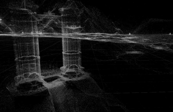
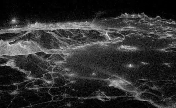
Sometimes visualizing everything can turn out beautiful results. It seems to work especially well when the data is geographic, as we saw with All Streets, OpenStreetMap edits, and tourist maps. It turns out the everything method works for fictional worlds, too. The above and the video below are nothing but 11.3 million deaths by impact with object or terrain in the game Just Cause 2.
Buildings, blimps, and rivers appear, and even if you’ve never played you get a sense of how the game is played.

Watch the video in its entirety below, best viewed in full screen HD.
Anyone play Just Cause 2? Does the map of deaths match your expectations?
[Video Link via @infobeautiful]


I’m a big fan of JC2, and I can confirm that this map reflects essentially everything from the gigantic map (400 sq. km). I didn’t identify anything as missing, and I say this as someone who has spent well over 100+ hours exploring. There are a few places where it’s especially bright, like under the Mile High Club (the floating club and brothel on a blimp) where players try to skydive over 1 km, and in the big television dish like from Goldeneye. It all looks good!
would be need to see this map materialize over time 10k deaths, 500k, 1 million….