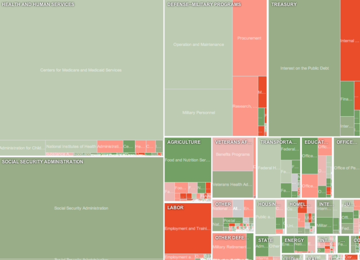
It’s that time of year again. Obama recently released his 2012 budget proposal for how to allocate $3.7 trillion. It’s complicated no doubt, but Shan Carter and Amanda Cox of the New York Times make it easier to understand with their interactive treemap. Rectangles are sized by proposed spending and colors indicate percent change from previous year. Darker red rectangles represent bigger drops from the 2011 budget and darker green greater increases. Zoom in and pan as you please.
Regular FD readers will recognize the style from last year’s graphic (also by Shan and Amanda) for Obama’s 2011 budget, but there are a couple of added layers of interaction this year, mostly focused on making it easier to find what you’re interested in. The first is a search box so you can easily search within categories. Search and the graphic zooms in on the area of interest. The second is links to areas of interest in the left sidebar, such as “cuts to low income home energy assistance.”
Finally, for the developers, you might be interested to know that this was implemented in JavaScript, as opposed to the usual Flash. So the interactive should work just fine on your iPad. The cool part of that though is that you wouldn’t even know the difference if you didn’t look at the source.
[New York Times via infosthetics]


Excellent use of an often badly used visualisation method.
Anyone got a UK one!?
Andy.
Do you have any thoughts on comparing and contrasting the NYT example with the treemap which appears on WhiteHouse.gov itself?
http://www.whitehouse.gov/omb/budget
I think each has its own merits. I find decisions to group or not group certain categories together to have significant consequences on the data’s readability. Consider the splintering of Medicare and Medicaid in the NYT version versus their clear and prominent place on the Whitehouse.gov version.
Is there a similar treemap available for the Republican’s proposed budget? It would be nice to see a comparison.