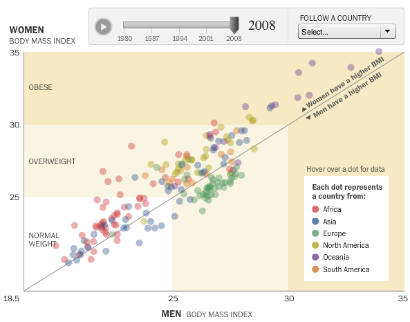
People are getting fatter everywhere. You know this. But there’s nothing like the numbers to actually show how we’re growing outwards and by how much. With this interactive, Wilson Andrews and Todd Lindeman, for the Washington Post, report:
With a few exceptions, the average body mass index in most countries has risen since 1980, according to a project that tracked risk factors for heart disease and stroke in 199 countries over 28 years.
Each circle represents a country, plotted by men’s BMI on the horizontal axis and women’s BMI on the vertical. Countries above the diagonal are countries where women have a higher BMI than the men, and vice versa for dots below the diagonal. Press play, and watch how BMI has changed from 1980 to 2008.
While all the countries are moving up and to the right, the Oceanic countries appear to have made the biggest moves over the past few decades, with several countries venturing into the obese BMI range.
Some European countries were actually making a move towards normal weight during the 1990s. Lays got the best of them though, and they could no longer eat just one. Damn you, Lays. I never win that bet.
[Washington Post via @hfairfield]


Am I the only one utterly confused by the fact that there seem to be more countries where women weight more than men? Why is this?
*and I mean have a higher BMI
I find this confusing. I read it initially as women are above the central line and men below it, but as I clicked through and looked at specific countries, each dot seems to represent both men & women for a country. Interesting, but ultimately confusing. What’s the point of the center line?
Each dot is a country, and it’s basically a scatterplot. So you have average BMI for men on the x-axis, and women’s BMI on the y-axis. You plot each point based on those two values. When women’s BMI is higher than the men’s it’s going to be above the central line. Otherwise, it will be below.
Very cool – what’s up with Pacific Islanders!? Also, if you can find the US (outer range of overweight, near the midline), it’s amazing how steady the BMI ration has been, even though both genders’ BMI has gone up steadily…
Looks like most if not all the European countries slimming down in the 1990s were the former Communist states. Anyone for the Fall of the Iron Curtain Diet? :)