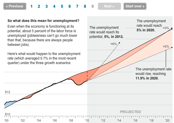
Neil Irwin and Alicia Parlapiano of The Washington Post report with this interactive graphic on why it doesn’t feel like we’re in a recovery:
The nation’s economic woes boil down to this. Compared with a healthy economy, about 7 million working-age people and 5 percent of the nation’s industrial capacity are sitting idle, not producing what they could. The economy is growing again, but at a rate — less than 2 percent in recent months — that’s too slow to keep up with a population that keeps increasing and workers who keep getting more efficient.
A step-by-step guide explains the output gap, the difference between potential and actual output.
[The Washington Post via @hfairfield]


Woah! The interactive one is great, but the static one is completely incomprehensible.
I could not understand this graph. I got to this page through a tweet. Perhaps it was intended as a recommendation on “how not to present data”.
I recall when people said equilibrium unemployment in the US was 2%, not 5%… Anyway, the static graph is a poster child for why it’s a bad idea to just snapshot dynamic material.
because nobody likes to click through on links.
* Face Palm *
The fact that the static graph is “incomprehensible” would be a real problem if it weren’t for the fact that it’s simply an illustration to go along with the post.
It’s not *meant* to be comprehended. It’s meant to entice you to read the post and follow the link. On that level, it worked perfectly for me.
JJ
Wrong…incomplete…and misleading. The economy doesn’t come down to one factor…as this suggests. Love it when “info designers” think they can solve a problem by visualizing. Try reading an actual economics text from one of the greats, Hayek, Mises or Rothbard.
Not to mention the questionable numbers provided by the Gov on real unemployment.
The static graph is perfectly understandishable to an engineer like me. I thought you guys could read infographics?
SPQR…You’re not talking to me, I hope.
If so, you’re missing the point. Unemployment is not a valid measurement of an economy by itself. This graph is not an “Explanation” of the current economic slump. It is a lagging indicator which by itself is unable to express or enunciate the complex variables tied to a centrally-managed economy; where the price, quantity and velocity of money are created by the Federal Reserve system.
Read more… at http://mises.org/daily/4724
I meant the fact that the first posters could not comprehend what the author was saying, not its arguable “correctness”.
Seriously? You could tell that the middle line was potential output and the other line was actual output? You could tell that the y-axis was GDP, given the graph was introduced as “here’s what would happen to unemployment” and the labels indicated unemployment?
I wish I had engineer powers.
With great power comes great responsiblility.
This graph ignores the exponential advances in productivity created by new technologies and does not factor these into its potential GDP forecasts.
Pingback: 4 liens rapides pour la semaine (2010-46) « La BI ça vous gagne!