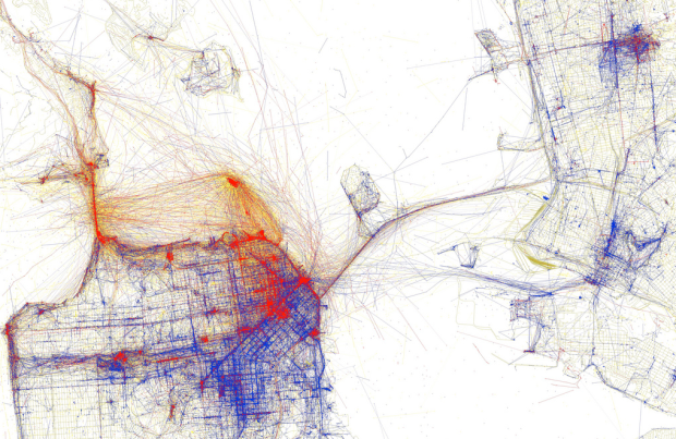
A couple of weeks ago you saw Eric Fischer’s maps of Flickr photos in major cities. The inclination was to think of the maps as a representation of tourist hot spots. The more pictures taken in an area, the more people go there to visit. That’s not necessarily the case though. Tourists might flock to an area and might completely neglect another, while locals might avoid the touristy areas.
In Fischer’s second run of maps, he makes an educated guess about the splits between tourists and locals:
Blue points on the map are pictures taken by locals (people who have taken pictures in this city dated over a range of a month or more).
Red points are pictures taken by tourists (people who seem to be a local of a different city and who took pictures in this city for less than a month).
Yellow points are pictures where it can’t be determined whether or not the photographer was a tourist (because they haven’t taken pictures anywhere for over a month). They are probably tourists but might just not post many pictures at all.
See the full set on Flickr. It’s even better than the first. [via | thanks, Joe]


love it
Pingback: Crushing Krisis › Wednesday Morning Remainders
Pingback: Bookmarks for June 8th through June 9th | The Stuyvesant Organization
Pingback: Turist-hotspots i Oslo