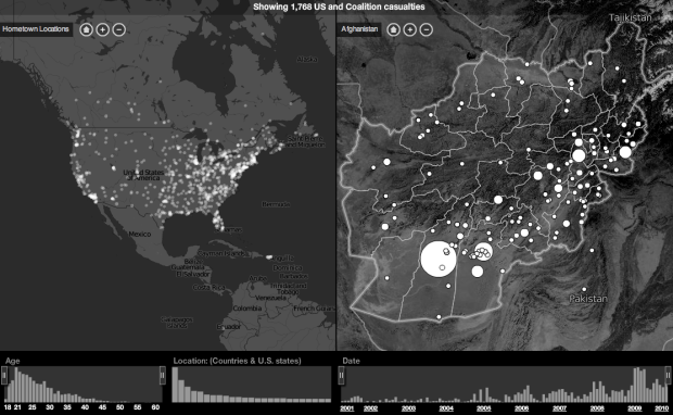
In a collaboration between CNN and Stamen Design, Home and Away offers a sobering view into casualties in Iraq and Afghanistan, since 2001.
On the left is a map that shows hometown locations, and on the right is a map of casualty locations. The two maps are linked such that you see where people are from and where they served. Linked filters on the bottom show distributions of age, location, and date. Select or search for an individual to see further details. Friends and family are also able to submit fond memories of fallen loved ones.
Altogether, the interactive provides a connection between the data and the people behind it. See the full piece on CNN.


Pingback: What diet pills work the best without having to do much or a diet?
Pingback: Digest – May 30 2010 – The Story
What defines “casualties”? KIA only? Wounded only? Wounded and injured? All three? This begs a couple of different maps, unless the intent is to sway public sentiment in which case it is very effective in fooling the average observer.
Well then, if I’d bothered to click the CNN link first, I wouldn’t have been compelled to post my previous.