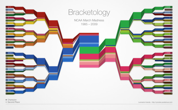
The Final Four is just about here. Who’s going to win it all? It’s anyone’s guess at this point, but what we can do while we wait is examine who’s won in the past. Leonardo Aranda takes a gander at who has won in each round since 1985, by ranking, with a color-coded bracket that resembles a stacked area chart.
I think if he used just two colors per corner (instead of entire palettes) and brightness indicating rank, it might be a bit easier to read in the first rounds. At the very least, you could find the Cinderella stories quicker, which is the most exciting part of the tournament a lot of the time.
I still like the concept though. It reminds me of Stephen’s crayon colors.
See the full-sized version here.
Who’s your money on?
[Thanks, Leonardo]


He needs to label the regions.
i don’t pay much attention, but isn’t the layout pretty standard?
No. This year, the East and South regional champs play each other in the Final Four; in 2008 the West and South champs played each other in the FF.
I’m confused about the columns on each side of the center column where the pairs of regions come together. Since different regions play each other different years, I wouldn’t expect those two columns to be the same height.
I decided to make the chart using the data from the brackets as they are distributed by the selection committee instead of rearranging this information to fit a region specific chart. Two reasons for this:
1. Teams are not locked to regions. To illustrate this: the last 10 times North Carolina has played the tournament, they’ve played 5 times in the East, 4 in the South and 1 in the West (some of these times the conferences were named by city and not region).
2. It is my understanding that there is a reason for the brackets to be the way they are distributed. Teams are actually seeded from 1 though 64 and I believe that the bracket arrangement reflects that.
OK, that answers my question above. But if you did do it by geographic region you could see if there is any region effect (not that I expect there to be, but we might be surprised).
Pingback: March Madness Bracketology | VizWorld.com
Nathan,
Thanks for the post. I hear what you say about the color. I would prefer it with less colors too but I just was not able to make it work. Contrast was a problem in some areas.
Fun visualization Nathan! I found another Final Four bracket perspective via social media sentiment at http://digg.com/d31MVq6 where you can see the sentiment around each of the college teams and TipTop search results with all the twitter commentary. Neat!
Pingback: Daily Digest for March 30th at dandube.com
I think if you consolidated all four regions into one viz, that would be much easier to understand. By consolidating I mean combining all four #1 – #16 ranks and showing how far each overall rank has gotten within the division.
While you may be able to make a case for who the best #1 team is overall, I don’t think much of a case can be made for who is the better #11 seed in each division. And besides that…is the top ranked team in the regular season rankings always the #1 seed in the same division every year or does that change?
Very nice job though. Definitely an intriguing viz.
this is really cool! i also stumbled across this great blog about jon scheyer and duke – check it out! http://www.achicagothing.com
Very neat. What program was used to create this? I`m new to all this stuff and can`t imagine it was with MS Excel…