Think Like a Statistician – Without the Math

I call myself a statistician, because, well, I’m a statistics graduate student. However, ask me specific questions about hypothesis tests or required sampling size, and my answer probably won’t be very good.
The other day I was trying to think of the last time I did an actual hypothesis test or formal analysis. I couldn’t remember. I actually had to dig up old course listings to figure out when it was. It was four years ago during my first year of graduate school. I did well in those courses, and I’m confident I could do that stuff with a quick refresher, but it’s a no go off the cuff. It’s just not something I do regularly.
Instead, the most important things I’ve learned are less formal, but have proven extremely useful when working/playing with data. Here they are in no particular order.
Attention to Detail
Oftentimes it’s the little things that end up being the most important. There was this one time in class when my professor put up a graph on the projector. It was a bunch of data points with a smooth fitted line. He asked what we saw. Well, there was an increase in the beginning, a leveling off in the middle, and then another increase. However, what I missed was the little blip in the curve in the first increase. That was what we were after.
The point is that trends and patterns are important, but so are outliers, missing data points, and inconsistencies.
See the Big Picture
With that said, it’s important not to get too caught up with individual data points or a tiny section in a really big dataset. We saw this in the recent recovery graph. Like some pointed out, if we took a step back and looked at a larger time frame, the Obama/Bush contrast doesn’t look so shocking.
No Agendas
This should go without saying, but approach data as objectively as possible. I’m not saying you shouldn’t have a hunch about what you’re looking for, but don’t let your preconceived ideas influence the results. Because if you go to length looking for some specific pattern, you’re probably going to find it. It’ll just be at the sacrifice of accurate results.
Look Outside the Data
Context, context, context. Sometimes this will come in the form of metadata. Other times it’ll come from more data.
The more you know about how the data was collected, where it came from, when it happened, and what was going on at the time, the more informative your results and the more confident you can be about your findings.
Ask Why
Finally, and this is the most important thing I’ve learned, always ask why. When you see a blip in a graph, you should wonder why it’s there. If you find some correlation, you should think about whether or not it makes any sense. If it does make sense, then cool, but if not, dig deeper. Numbers are great, but you have to remember that when humans are involved, errors are always a possibility.
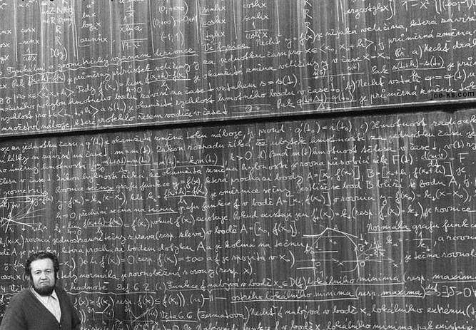
*Photo by misterbisson
57 Comments
Become a member. Support an independent site. Get extra visualization goodness.
See What You Get


Hi,
I’m post gratuate in Computers and I work as software Tester, basically, I’m interested in Data visuals and I want to register for Phd in Data Visuals…So kindly let me know study materials and Conferences which I should be following… Thanks for your help.
think like a statistician: Kaiser Fung (from junkcharts) just wrote a book about it
http://weblogs.baltimoresun.com/business/realestate/blog/2010/03/thinking_like_a_statistician.html
Great post! Thank you for sharing your insight!
Interesting read! Will keep your thoughts in mind for an upcoming project. Cheers!
This is one of the better posts on statistics (and data analysis in general) that I’ve read in some time. Well done.
Excellent post! Pretty much summarizes the important topics anyone working with data has to keep in mind. I would also include “Explain Why” – another important ability. It takes a lot of time and effort to perform analysis on data, especially data in which we are not familiar. Articulating results can make the analysis much more powerful!
Good post, but these are really basic things that anyone doing any kind of quantitative analysis should regard as fundamental. These guidelines should be so familiar that they should not require any conscious thought. They are essential to a quantitative perspective of the world. I read them and thought, well, yeah, of course. I suppose it is worth reading as a reminder, or for beginners.
I agree with @jasprice about including “Explain Why”. I would go one step further and add “Translate conclusions into easily understandable results.” I do a lot of quantitative analysis. It is extremely important to be able to effectively communicate the importance of a key result to a person (or group) that does not have a quantitative background…especially if it is someone in a leadership position, i.e. your boss!
Absolutely. You have to remember though that are a lot of people who are doing this ad hoc. Even for me this was interesting, because I don’t typically think about, well, how I think :)
I own a book that goes into some of this, ‘Turning Numbers Into Knowledge: Mastering the Art of Problem Solving’, by Jonathon Koomey. It addresses the issues you mention on a qualitative basis. It is useful and a quick read.
I would add that these basic rules are actually not nearly as much help as you would expect without a working background knowledge of the topic being studied. Applying statistical techniques, without knowing background facts of the research design and the particular variables being measured only gets you so far. In fact, a few of the things you cite above, such as looking outside the data, and asking why (or digging deeper) are almost entirely dependent on background knowledge of that topic.
Sometimes some of this background knowledge is near universal, but that obscures the fact that we are using it (and can also lead to overconfidence in other situations which demand specialized background knowledge). I think education research is a classic example of this, where people think they have enough background knowledge to interpret the results, but in fact few do.
@Cedar – i agree with you completely, and that’s what i was trying to get at with looking outside the data. the context, or background, plays a huge role in the analysis and the results.
Wow,
it is very interesting how the picture used in this post travelled through whole world to appeared here. It is my professor of Math from the West Bohemian University in Pilsen, Czech Republic. ;)
Pingback: Look at Data Like a Statistician, Minus the Ph. D [Statistics] · TechBlogger
Your RSS feed subscribe link does not render properly… I want to subscribe, can’t. :(
@Robert – it seems to look okay for me. do you know what exactly is looking weird?
Thx for reply Nathan. It renders as XML code, as below, in both IE and Chrome:
–
–
FlowingData
https://flowingdata.com
Strength in Numbers
Thu, 04 Mar 2010 16:13:16 +0000
http://wordpress.org/?v=2.9.2
en
hourly
1
http://creativecommons.org/licenses/by-nc-sa/2.0/
–
Think like a statistician – without the math
http://flowingdata
@Robert – that’s actually RSS. if that’s not your thing, you can also subscribe via email:
http://www.feedburner.com/fb/a/emailverifySubmit?feedId=1002313&loc=en_US
sorry for the slight sidetrack, but the image you’ve used as an illustration is awesome. where did you get it from? do you have any background on it? thanks…
oh, or lukas, above…
@Andrew – i got it from flickr. see the link at the very bottom of the post.
Just like Lukas wrote it’s Prof. Jiri Cisek (Jiří Čížek). Photographer Milan Kollinger took it at the Faculty of Applied Sciences University of West Bohemia in Pilsen in 1998.
http://translate.google.com/translate?hl=en&sl=cs&u=http://www.kma.zcu.cz/&sa=X&oi=translate&resnum=3&ct=result&prev=/search%3Fq%3DWest%2Bbohemian%2BUniversity,%2BDepartment%2Bof%2BMathematics%26hl%3Den%26client%3Dfirefox-a%26channel%3Ds%26rls%3Dorg.mozilla:en-US:official%26hs%3DndL%26sa%3DX
Pingback: Think like a statistician – without the math / what consumes me, bud caddell
Great post! Thanks!
Sorry, I don’t this advice as helpful. I’m not statistician but I was least somewhat exposed to it in grad school.
You underestimate the difficulty someone with little maths understanding would have doing the operation “think about whether or not it makes any sense.” If someone doesn’t know things like what is or isn’t a normal distribution and why it matters, they really can’t distinguish wishful thinking from evidence based reasoning. Look at the number of wrong statical arguments, by statisticians and mathematicians. These indeed come by not “digging deep” but this deep digging only happens when you know what the different correlations mean. Black-Scholes and the Guassian Copula are good examples of statistic gone wildly wrong with serious consequences. A moderate of understanding of distributions lets someone somewhat understand why people are questioning these now. But without the maths, a person “digging deeper” is going to be lost.
@Joe the User – I’m not saying this stuff is easy to learn though. All I’m saying is that this is the most important stuff that I’ve learned over 4+ years in graduate school. So many people think that statistics is all hypothesis tests and similar formal tests – many who took intro stat in college and think that’s everything. All that stuff is secondary to the above.
Great bump on lifehacker! :) Wtg Nathan.
Pingback: iPad Links: Thursday, March 4, 2010 « Mike Cane's iPad Test
Pingback: Think Like A Statistician Without The Math « Knol Bits
Simply great. Can we have some more ??
I agree with some of the other posters here when they say these are really basic / fundamental items and that without an understanding of what the person is actually looking at – just trying to draw conclusions is disastrous. ( As often happens at the work place)
—
On a side track – do you know of any good data visual softwares ? Microsoft Pivot comes to mind but I dont have the pre reqs for it. Also I m looking for an open source alternative – convincing the boss for $ is going to be tough right now.
Pingback: Links for March 4th, 2010
The very notion that a substantial understanding of any substantial piece of maths can be had without proficiency at the henscratches is asinine.
Pingback: Muslim Demographics
Great post. I also think that in a business situation there often isn’t time to do all the formal maths stuff. I think it gives you a great grounding but often questions need to be answered quickly and simply and with a best guess, and people can’t hang around waiting for you to do all the fancy maths.
Pingback: Four short links: 5 March 2010 « Murder Manual
Pingback: links for 2010-03-05
Excellent post are very good recommendations.
A few more principles to complement those in your post and in the comments.
1. Always ask “what’s missing?”
2. Create multiple views of the data. A single view is never enough for real situations
3. Craft a story, tying together the different views
4. Make the data available to others in a readily reusable format so others can work/play with it and possibly discover views you may have missed, thereby opening up a dialogue
5. When creating views, experiment with different granularity. One size does not fit all.
6. Write down your assumptions, biases, hypotheses BEFORE gathering, assembling, and analyzing the data. Keep a record of how often you are proved wrong. It better not be zero% or you are either fooling yourself or not tackling very serious issues.
Obama’s economic team is Bush’s economic team. Why should we expect any differences?
Pingback: Daily Digest for March 5th at dandube.com
Pingback: links for 2010-03-05 | The 'K' is not silent
Pingback: Weekly Roundup: Design Related Links #10 « Discovery Session… by Gerard Dolan
Thanks for sharing these fundamentals, because they ARE important. A lever is a simple machine, but no one criticizes the claw hammer as unimportant because it is a fundamental, elementary use of physics.
I am a test pilot and work daily with engineers, aircraft designers, and people who make decisions about how much money to spend on these projects. These fundamentals are key elements of how the data tells a story to these decision makers. And it is precisely these fundamentals that they need to make their decisions.
It’s easy to forget why we started studying this material and the people who it will help.
Pingback: links for 2010-03-07 | Kabam!
Pingback: Notional Slurry » links for 2010-03-07
Pingback: Think like a statistician
Pingback: 5 Ways to Look Smarter in Meetings by Learning to Interpret Data on the Fly | Business Hacks | BNET
Great post. These are very simple things that we often forget to do, but are very important in looking at the larger picture.
Pingback: Piense como estadista – sin la matematica « CommunitiesInABox
Pingback: Running the numbers (Small Business E-commerce Link Digest – March 13, 2010)
Pingback: Pensa come uno statistico – senza la matematica « Sbagliando s’impera
I am an accredited statistician but am also active in other areas of analysis and visualisation. I find your point on hyptothesis testing interesting; indeed, I haven’t done one, or recommended one be done, for years. I find all too often that people who want hypothesis tests revere the concept of ‘statistical significance’ without looking further to the ramifications of their decision process.
Pingback: Andrés Catalán | Let them eat data!
Pingback: Data 2010 «
As a practicing real estate analysts and appraiser, i found these comments to be right on the mark. the ability to differentiate between “numbers” and “what the numbers mean” is absolutely crucial.
Pingback: 增强视觉 | 计算机视觉 增强现实 » 仅仅是贴图
Pingback: “Lies, Damned Lies and Statistics” « Harmonic Investment Advisors