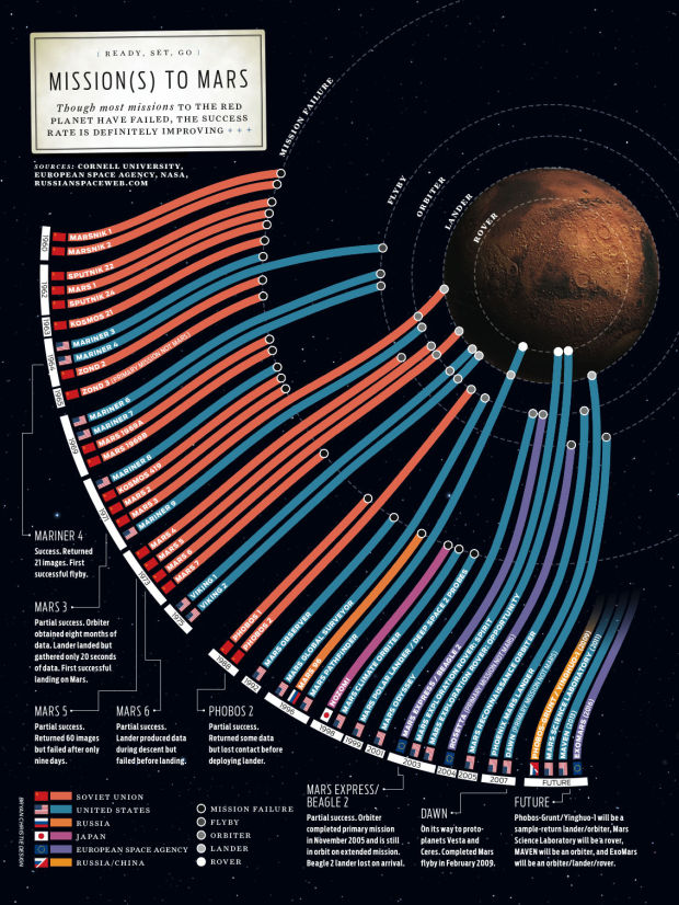
The above graphic shows missions to mars starting in 1960 to present (top to bottom). Paths are colored by country, and as you can see it’s been a lot of missions from Europe and the United States lately. Obviously the farthest we’ve gone is with the rover with more to come.
(I couldn’t figure out where the graphic originally came from. Anyone know?)
[via Fast Company | Thanks, Travis]


IEEE Spectrum special Mars Issue and by Bryan Christie Design
Pingback: Shared Items – October 26, 2009 | Joseph Nathan Cohen
Pingback: Visual data: missions to Mars : Contrarian
I can’t read the text because it’s too small, but the first missions to Mars were in 1960, not 1950.
thanks, jon. fixed.
It is a lovely graphic, but its a shame that the key is meaningless.
All the failed missions have the same white ring and all end on a dashed line marked mission failure. It would have been far more interesting to use the mission failure dashed line to represent a mission failure with the ring at the end of the coloured path representing what the intended mission was ie/ lander/rover/flyby
I agree, James. So much more information could have been packed into that graphic.
However, I still like the image. It’s lovely.
Below link is a great article about how the best chance for a Mars mission is for the explorers to go on a one-way ticket. Would you do it?
http://www.universetoday.com/2008/03/04/a-one-way-one-person-mission-to-mars/
Pingback: Daily interesting articles | Aww Dip
Pingback: Interesting links for week ending November 6th | Interesting Things
Pingback: Το Top 5 της εβδομάδας (22 ÎοεμβÏίου – 28 ÎοεμβÏίου 2009) | Newsfilter