Ever since I posted my visualization that shows the spread of Walmart, I’ve gotten a lot of emails asking how I did it, if I’ve considered applying it to other datasets, or if I could help with a customized version of the Walmart visualization. I’ve gotten similar inquiries about the gas price graphic. This makes me wonder — is there a market for premium visualization online?
Existing Premium Visualization
I know there’s definitely a market for data-specific visualization – viz made specifically for a certain type of data – otherwise design groups like Bestiario and Stamen wouldn’t be around. But what about visualization that developers (or non-developers) can integrate into websites and applications with their own data?
FusionCharts
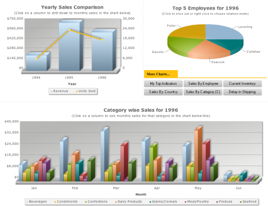
For example, FusionCharts lets developers integrate the more traditional visualizations like bar charts and basic maps into their websites. Everything runs in Flash and has a little bit of animation and some interaction. According to the site’s homepage, 30,000+ developers use FusionCharts. Licenses run from $69 for individuals to $1,999 for enterprise.
Constellation Roamer
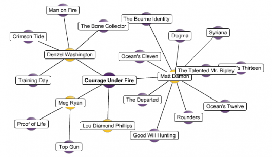
Daniel develops Constellation Roamer. It’s a network graph interface that lets you explore connectedness. The Roamer has been out for about four months now and according to Daniel, has sold about 10 individual licenses at $550 each. This is interesting because the leads come from search engines without any advertising or publicity. While the sales are modest, he’s also gotten a lot of freelance work for customized versions of the Roamer to keep him plenty busy.
Relation Browser
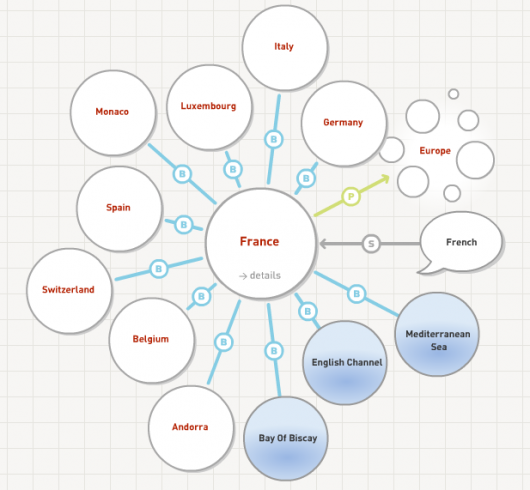
Similarly, Moritz developed Relation Browser a couple years ago and says he gets an inquiry about once a week even though, like Daniel, doesn’t advertise. Relation Browser is a network graph visualization that lets you explore relationships. The example below shows relationships between countries, but can also be applied to something like a social network. Moritz releases his code for free, but requires commercial vendors to purchase a license for 400 Euros (about $600) each.
Free Visualization Tools
So there’s definitely some kind of demand for a more refined online visualization; however, there’s been a growing number of free visualization tools available to developers. Do these take away the need for paid online visualization tools?
Google Visualization API
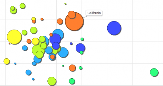
Most well known is perhaps Google’s visualization API that they released in March, including the motion chart shown below. The API also includes a basic graphing utility along with a hodge podge of some other, uh, not so useful tools.
Many Eyes
Many Eyes promotes social data analysis and is best known for its interactive visualizations. Last year, they brought embeddable visualization, mostly for bloggers to share with others. However, the drawback is that you can’t push frequently-updated data into the Many Eyes application. The only way to get an updated visualization is to edit an existing dataset or upload a new one manually.
Room for Both Free and Premium
It seems that there’s room for both. While the free tools from Google and Many Eyes are useful in their own right, premium visualization can provide a higher level of customization (for complex data streams and aesthetics) and integration into a site or an application.
Tweeting Thoughts
I asked the same question on Twitter a few days ago and got some interesting responses from my Twitter friends:
@Omomyid: hmmmmm, how would you make it extensible though? The thing about cool infographics is that they are purpose built right?
@chris23: prolly a possible analyst service to provide visualizations/tools for market interests.
@der_mo: yes, totally. I keep selling the relation browser (http://der-mo.net/relationB…) although it is a couple of years old…
@hungryclone: maybe to companies w/ no dedicated employees that know how to make them?
Your Thoughts
What do you think? Is there a marketplace for visualization on the web or do the free APIs make it a moot point?


it’s kind of like asking is there a market for hand crafted furniture given the IKEA exists.
trouble is, everyone know what furniture is, and what premium furniture is.
your market might not even know what visualization is, let alone premium.
so i guess you are on the right track by creating examples that give people the “ah-ha” moment where they wonder if their own data could be like that.
I remember a sales executive once pointed at the weather map in a copy of USA Today and said ” can you make this with my sales data?”
maybe you should put a link under your graphics that say
“hire me to work with your data”
Nathan,
following up our twitter convo …
I can sort of see two markets/products where this might work.
In either case I envision building a library of “advanced” visualizations that customers would plug their data into and then customize to their needs.
Nothing profound here but I see the markets as publishers (think news outlets, blogs, etc anyone who isn’t like the NYTimes with their own info graphic designers) and analysts.
I think there is – however the challenge is making it a “deployable” package if you want to target corporates as customers.
Whether deployable means it is integrated to a corporate IT system or offered as a SaaS type of offering. Outsourcing BI is difficult because the “other” data sources (eg Sales $, Volume) is generally stored in-house. Working for a large retailer (not Walmart) we would love to have this advanced visualisation capability deployed on our intranet /extranet whatever…however there would need to be a business case detailing tangible benefits and considerations made with integration with existing data pools / warehouses – difficult stuff
Personally….I love it. Keep it going.
The need is definitely there. As a consultant, you could produce custom visualizations. These would likely be one-off projects but would build a resume of projects and web of contacts (the biz world, especially within a sector or within a city, is smaller than you’d think, even in a place like NYC).
The need is definitely there. As a consultant, you could produce custom visualizations. These would likely be one-off projects but would build a resume of projects and web of contacts (the biz world, especially within a sector or within a city, is smaller than you’d think, even in a place like NYC).
The need is there. Unfortunately, if it’s being met, it’s with packagees like FusionCharts that make it too easy to produce distracting visual extravaganzas like the three Fusion examples you supplied. (In fact, I featured the FusionCharts Funnel chart in Bad Graphics – Funnel Chart.)
The real question, is who can put these lame 3D effects aside and introduce a package for the masses that enables effective data presentation. I’m thinking of a broader implementation of something like BonaVista MicroCharts, not a 4D version of FusionCharts.
I definitely see a market for these services. Many organizations and individuals would love to take advantage of this technology but don’t have clue how to begin. The free services are great like Many Eyes and Swivel but they’re somewhat limiting and not entirely intuitive.
Another possible market can be found in Nicholas Felton’s Personal Annual Reports –
http://www.feltron.com/index.php?/content/2007_annual_report/
If users could easily plug in personal attention data each week and at the end of the year have a professional and attractive “annual report” produced, I could see such a service be quite successful.
Tim – let’s assume people know about my furniture. i’m not wondering so much about getting work as i am about selling software.
Tim – let’s assume people know about my furniture. i’m not wondering so much about getting work as i am about selling software.
Tim – let’s assume people know about my furniture. i’m not wondering so much about getting work as i am about selling software.
So here is the problem as I see it:
At one end of “premium” is the once-off “artisan” job. An example of this would be if I commissioned Nicholas Felton to build something beautiful and unique using my own personal data. At this end, you have to be good enough to charge $$$ for each job, or else your $ per hour of effort is low. So I don’t think this is a market for a software product.
At the other end of “premium” is the software approach. It scales better as you sell licenses so your $ per hour of effort can be high. However, at this point you have to compete with free software and commercial software like you showed (and stuff like dotnetcharting.com) However, it is still hard for the average person to make something like your walmart map using those tools. If you could make it easier then you might be on a winner, but it’s a tough ask.
For example, I could just plug my personal stats into many eyes, but it just doesn’t excite me because it is all to vanilla. So applying the above idea would require something that let me put my stats in (assume I am not a programmer) and produced something nicer than many-eyes, but it still wouldn’t be as good as a custom feltron original.
Funny about that… and here’s a little scoop for flowing data:
Look at: http://daytum.com
(@Scott – your wish came true?!?!)
Another way to look at it is from the horizontal vs. vertical perspective. The software you listed as examples are basically horizontal. That is, tools that you can apply to various specific viz tasks. I wouldn’t try to compete with free tools or BigSoftwareCompanies in that space.
There’s probably a market for vertical visualization however. Pick a specific subject or business and make the best visualizations for that space, say car dealership for example (http://www.dealerdiagnostics.com). Take all the tech-pain out of it. Sell that as software. You can probably find a well paid niche to avoid competition, but you’ll need the expertise and experience in that vertical to be able to imagineer something great.
That’s really what daytum is doing. A “personal stats” vertical using horizontal software (in this case google charts api).
Fun conversation here Nathan!
I can say from experience that this market exists. It is what we do at Juice Analytics. However, making advanced data visualization useful is both a technical challenge and a design challenge.
There are at least three hurdles that we typically see:
1) As noted by Peltier, implementation by someone who doesn’t understand infoviz fundamentals can end up eye-gougingly ugly and useless.
2) Data integration is non-trivial. If you are connecting to a public and well structured API, creating cool visualization mashups can be easy. Pulling data from proprietary enterprise systems is a whole different ball-o-wax.
3. None of this is valuable unless there is a lot of thought put into how the advanced visualization can connect to existing work processes and the decisions users need to make.
ILOG Elixir (http://www.ilog.com/products/ilogelixir/) is another example of a set of visualization components. At Juice, we’ve got a similar toolkit of Flex-based components which are a bit more, um, Tufte-compliant.
Zach, Jon – the ugly factor doesn’t concern me so much from a sales standpoint. To go back on fusionCharts, it’s simply a (semi-)customizable viz package for developers to integrate into their websites. Fusion provides tools. It’s not their fault a developer uses viz incorrectly in the same way it’s not Craftsman’s fault if someone tries to smash in a nail with a wrench.
I do agree that FusionCharts aren’t especially elegant, but it is successful, which says something.
I believe there is. But, initially it is more a service demand than a product. Even if we take a simple example of say Excel, being able to produce useful meaningful charts is still a skill that not everyone who uses excel has, even though they could set up a fairly complex spreadsheet.
Much like other emerging technologies, I feel data viz is ahead of the wave and clear defined business benefits/measures are yet to be available and understood across many business domains.
Without measurable benefits, and I’m not saying they don’t exist, just that they are not clearly articulated to the business audience yet, service firms will require a “leap of faith” during the sales process.
If you look at Stamen as an example, they have a great niche but the companies are still other visionary startup style companies.
That said, the skills involved in handling terabytes of data, data mining that set and representing it for consumption and interaction using data viz are rare and demand of them is only going to increase over the next couple of years.
From my experience there absolutely is a market for “premium visualization online”. I’ve used a half a dozen or so such products (of varying quality, with varying success..) in the past 4 years.
But I agree with what Ben had to say. After using various products for a while, I’ve concluded that the really “interesting” visualizations can’t be bought. They have to be built. A simple bar, line, or pie chart can now be done easily out of the box with something like fusion charts. But if you want to get into what I consider “premium visualizations…” you gotta build it. The good stuff is specific to your data – no generic tool will do.
Fortunately things like Flex/Flex Charting are finally giving us the tools to do just that.
As long as there is interesting data there will be interesting, custom, views that need to be built.
Pingback: LinkSnack | ettf.net
Certainly, look at a bloomberg terminal.