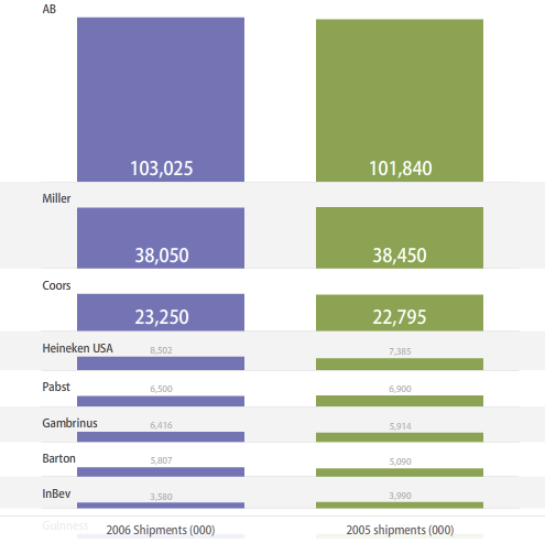
Are bubble charts effective? This seems to be a recurring question. Some say people suck at comparing areas in the form of bubbles, or rather, people are horrible with areas, period. Others argue that it just takes some getting used to; the eye has to be trained, and once that’s done, the bubbles are good to go.
In any case, here is an alternative to the bubbles — bars. The beer data from a previous post are charted (2006 shipments on the left, and 2005 shipments on the right). The advantage of bars over bubbles is that users only have to compare heights; however, numbers are going to clutter quickly as more observations are added.
People should just train their eyes. Bubbles are so much more fun. They’re bubbly.


You should probably also read up on fluctuation diagrams and mosaic plots, which can be more informative for this type of data.
I was just talking about a direct alternative to a bubble chart in a table layout, but yeah, for sure, mosaic plots are great for this type of categorical data. I’m not a huge fan of fluctuation diagrams however. They often seem to be really sparse.
They can’t be any more sparse than the equivalent bubble chart, can they?
The modified bar chart almost works. I find that the width of the bars is somewhat distracting, and the gap between the columns of bars makes it hard to compare their relative heights (unless there is a large difference). I think a clustered bar or column chart would be at least as effective as this chart (and well beyond the bubble chart in the first article, which was absolutely the wrong type to use).
Hi Nathan –
I finally got around to making an alternative chart to your floating stacked bar chart above, which is simpler, easier to interpret, and easier to produce:
http://peltiertech.com/WordPress/2008/03/06/clustered-bars-as-an-alternative-to-stacked-bars-or-bubbles/
Let me know what you think.
Bars vs bubble charts? Bars serve beer. Beer has bubbles. What are you charting? How bubbly is your beer or how many bars can you get the bubble beer at?
Bars vs bubble charts? Bars serve beer. Beer has bubbles. What are you charting? How bubbly is your beer or how many bars can you get the bubble beer at?