Fast Food Menu of Calories
In my younger days, I used to eat fast food all of the time. So cheap. So delicious. But these days, it’s all about moderation. My metabolism no longer supports the same amount of fried food. The hours I spend in front of a computer instead of moving probably don’t help either. In any case, I have to pay attention to the calories.
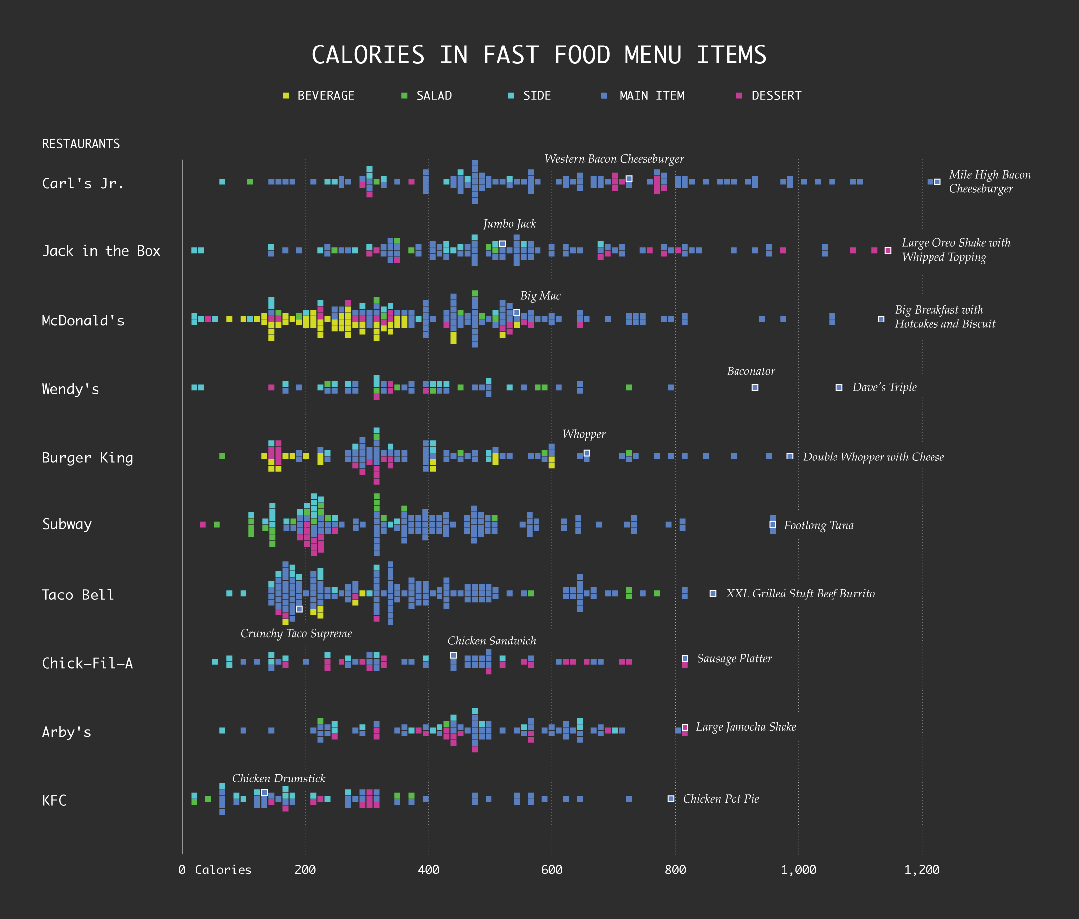
I was curious: How does the distribution of calories vary by fast food restaurant?
Here’s a chart that shows all the menu items for ten of the biggest national fast food chains. Each square represents an item, and each row represents a restaurant. Items farther to the right are higher in calories and items to the far left are probably a side of apple slices.
 Drawing Squares and Rectangles in R
Roll your own rectangular-shaped charts.
Chart Type Used

Become a member. Support an independent site. Get extra visualization goodness.
See What You Get