Visualization is complex, but if I were to break it down simply, I’d say it’s something like the process below.
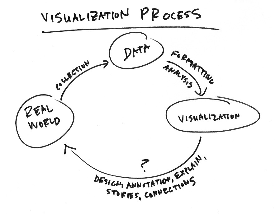
Start with real life, the environment, or the actual phenomenon you want to measure. Collect data to estimate and record, because it can be a challenge to observe things right as they happen. Then visualize the data.
Now here’s the key. You have to get from here — the visualization — back to real life. Or, if the visualization is for an audience, you have to get them back to real life.
You have to connect data, which is simply a representation, to the real thing. The shorter the path, the better.
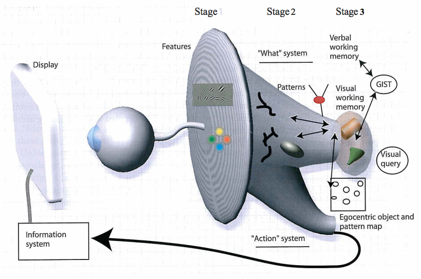
Colin Ware, in Information Visualization: Perception for Design, breaks down visualization perception into three stages.
- Parallel Processing — Seeing colors and shapes.
- Pattern Perception — Seeing patterns among the colors and shapes.
- Goal-Directed Processing — Interpretation of patterns based on what you look for.
People agree on most research and advice on the first two stages. Certain visual encodings are easier to see than others, and you must be wary of visual blindspots and biases.
At the extremes, you end up with optical illusions like the one below. It shows 12 dots, but no matter how hard you try, your brain won’t let you see all of them at once.
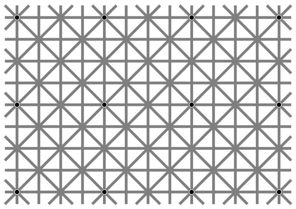
In less dramatic examples, you might end up with color differences or slope changes that look more significant than they actually are.
So learn visualization basics and the rules of human perception. Otherwise, you or your readers are stuck midway in the path back to reality.
Now for the third perception stage: Goal-Directed Processing.
Goals change by individual, by audience, and by application. Someone who works with data on the regular interprets the results in a graph differently that someone who barely knows what visualization is. Sometimes we are after something more visceral or emotional than quantitatively insightful. This requires different design decisions.
Part of why geographic maps work so well is that they’re rooted in the physical world. It’s less of a challenge to connect a picture of roads on a map to the actual road you drive on. If you’re familiar with a place or boundary, you can recognize what a map shows even if it doesn’t have labels.
In contrast, a more abstract visualization method requires explanations and guidance for someone to first, read the data behind the encodings and second, to recognize what the patterns mean.
Whatever it is you’re looking for, remember this path to reality. Try not to make it too difficult to get back to where you started.
 Visualize This: The FlowingData Guide to Design, Visualization, and Statistics (2nd Edition)