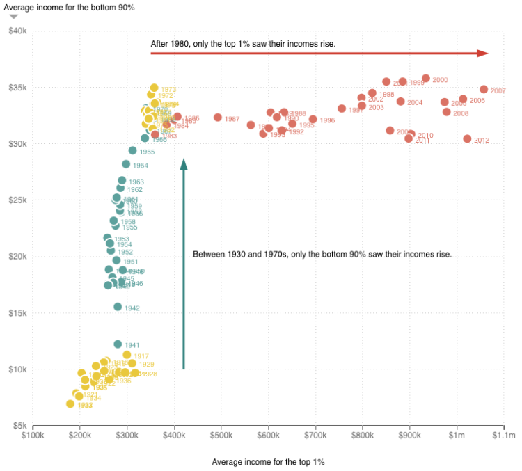
Quoctrung Bui for Planet Money plotted average income for the top one percent of earners against the average income of the bottom 90%, from 1920 to 2012. Through the 1970s, the animation shows rising income for the bottom and relatively static for the top and then vice versa after that.
Of course, now all I want to see is everything in between: the distribution of earnings of these two groups and the middle group between 90 and 1 percent. Good thing you can download some of that data yourself from the World Top Incomes Database.

 Visualize This: The FlowingData Guide to Design, Visualization, and Statistics (2nd Edition)