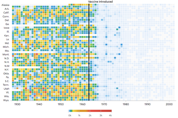
Not that anyone who does not vaccinate their kids cares, but Tynan DeBold and Dov Friedman for the Wall Street Journal show the change in number of cases for various diseases after a vaccination is introduced.
Each row represents a state, and each column represents a year. So each cell represents the number of cases per 10,000 people, in a state for a given year. The above shows the change for measles cases, which you can see a quick rate decrease after the introduction of the vaccination in 1963.
I’m not sold on the color scheme, which seems arbitrary with six shades from minimum to maximum. Saturation only changes at the low rates likely used to accentuate the drop after a vaccine. However, as you mouse over cells in each grid, an indicator appears in the legend to show where the rate is in the color scale, so they can kind of get away with it.
Kinda like it, kinda don’t. Still important information.

 Visualize This: The FlowingData Guide to Design, Visualization, and Statistics (2nd Edition)