It’s always tough to pick my favorite visualization projects. I mean, it’s a challenge to pick and rank your favorite anything really. So much depends on what you feel like at the time, and there’s a lot of good work out there. Nevertheless, I gave it a go.
These are my favorites for the year, roughly in order of favorite on down and based on use of data, design, and being useful. Mostly though, my picks are based on gut.
One unintentional theme: All of my picks are interactive or animated or both. Telling for where we’re headed, I guess.
The Upshot
Last year, Nate Silver took his ball to play elsewhere, so the New York Times had a data-centric hole to fill, and they came out better for it with the Upshot. Whereas FiveThirtyEight kept their charts simple when it was with the New York Times, the Upshot tapped into the skilled in-house graphics department (along with a handful of new hires). And yeah, while I realize the Upshot is more than a data graphics machine, it might as well be in my eyes.
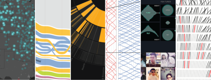
If I didn’t cluster the Upshot visualization projects into this one section, the individual works would dominate the list. Here are a few of my favorites.
Where We Came From and Where We Went
No doubt feeding off the popularity of the dialect quiz map from the end of 2013, the state-by-state migration charts were also fun and playful. Gregor Aisch, Robert Gebeloff, and Kevin Quealy went with ribbons over a more conventional stacked area chart which allowed for clearer comparisons.

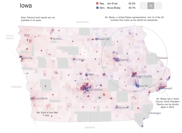
The Most Detailed Maps You’ll See From the Midterm Elections
The Senate results map from this year’s midterm elections were impressive. Super detailed down to the voting precinct, high usability, and use of alpha to represent population density.
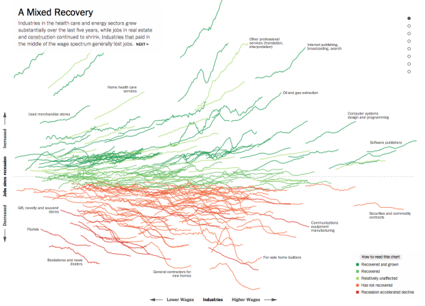
How the Recession Reshaped the Economy, in 255 Charts
If I remember right, these charts showing job recovery and loss was one of the first large-ish projects from the Upshot. You start to scroll, and then the lines do this explosion thing showing breakdowns and highlights in the data.
Plenty more Upshot projects found here.
Visualizing Algorithms
Mike Bostock does lots of great things with and for visualization. Visualizing Algorithms was one of those things this year. Bostock demonstrated processes and patterns in a wide array of algorithms for sorting, sampling, and maze generation. The result was a useful learning resource and an appreciation for something that’s otherwise a challenge to imagine for most people.
Visualizing MBTA
Some of the best projects come from students who are learning new tricks and trying to figure out what works and what doesn’t. I think it comes from a combination of time availability and an eagerness to absorb information. Michael Barry and Brian Card used their time to visualize public data about the Boston subway system. The small subway map that accompanied each time series visual lent a good link between the explorations.
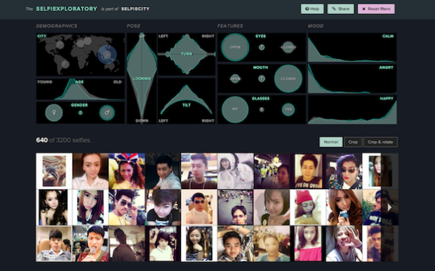
Selfiecity
I forget where I was, but I was having a coffee somewhere and it started to rain outside. I saw people going for shelter, but I saw a couple of teens stop in their tracks to take a selfie. I thought that was weird. And then I felt out of touch. I just don’t understand that culture, but Selfiecity by Lev Manovich, Moritz Stefaner, and team does a good job dissecting it. The use of Mechanical Turk and face recognition software brought your standard photo mosaic up a notch.
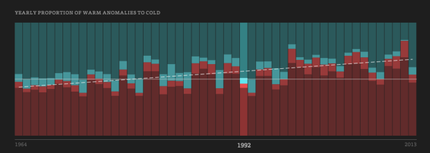
Temperature Anomalies
Is it getting warmer? Is it getting colder? What’s the deal with climate change and all that? Enigma.io used some basic statistics and publicly available temperature data to find warm and cold anomalies in the United States. Then they animated daily data from 1964 to 2013. The map is mesmerizing, and it’s a good example for what a little bit of analysis before the visualization can do.
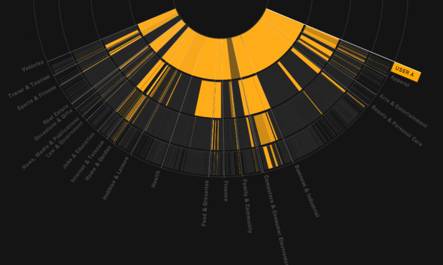
Floodwatch
We’re at this weird point where a significant proportion of online users know that their activity is tracked by advertisers. But, a large portion of that group doesn’t seem to care. Floodwatch, a Chrome plugin by the Office for Creative Research and Ashkhan Soltani, tracks the ads served to you. The project (1) lets you look back at your banner history and (2) provides an opportunity for researchers to try to figure out the banner-serving black box. Maybe a few more people will care.
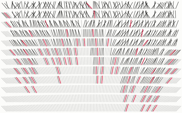
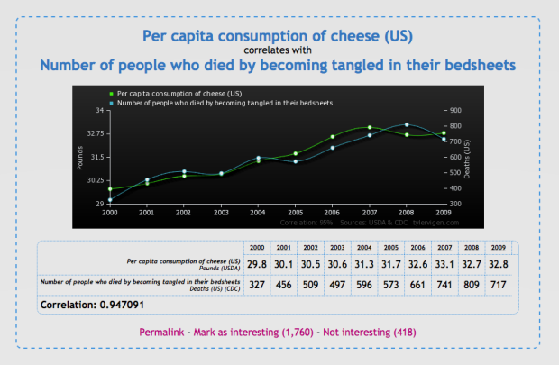
Spurious Correlations
Most of us have heard the correlation-is-not-causation spiel by now. Sometimes though, the spiel just feels like empty words that people don’t really understand. Spurious Correlations by Tyler Vigen drives the point home and provides some fun in the process. About once a minute, Vigen’s script looks for a random things that correlate and then spits it out in a tumblr-like fashion.
Spaxels
Ars Electronic Futurelab equipped quadcopter drones with LEDs and programmed them to fly in formations that could be controlled from the ground. It’s not data visualization per se, but the prospect of flying pixels in the air is pretty awesome. More advanced city alerts? A Batman signal that doesn’t rely on clouds for contrast? Extravagant air-writing marriage proposals? Oh, just imagine the possibilities.

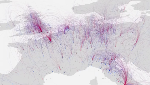
Cultural History
Researchers used birth and death places of “notable individuals” as a proxy for geographic cultural history. The premise is that if a lot of people move somewhere and live their last days in that place, then that place must have it going on. So it’s not quite just a map with moving bits. Rather the connections represented by blue and red arcs possibly mean something more.
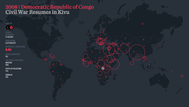
The Refugee Project
The interactive by Hyperakt and Ekene Ijeoma shows United Nations estimates for refugees around the world from 1975 to 2012. There’s a fine aesthetic and usability, but the callouts to events in history make the Refugee Project one to come back to.
 Visualize This: The FlowingData Guide to Design, Visualization, and Statistics (2nd Edition)